The world of typography
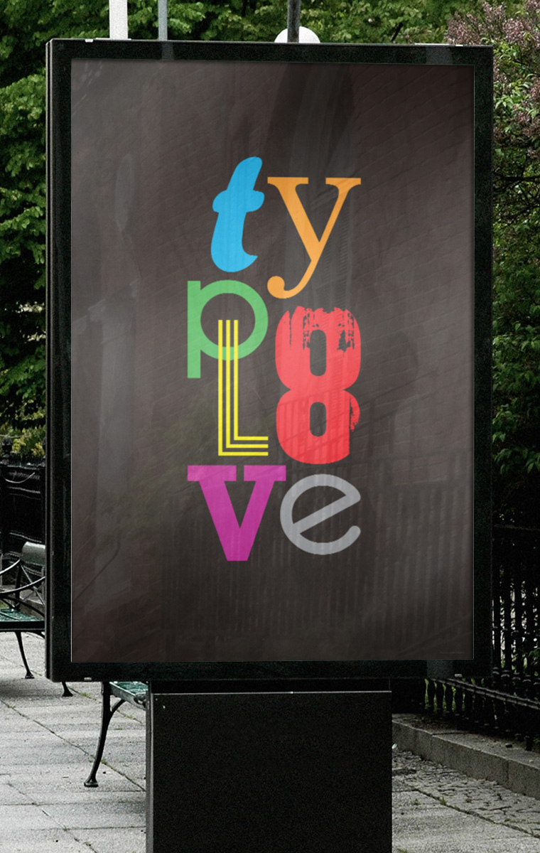
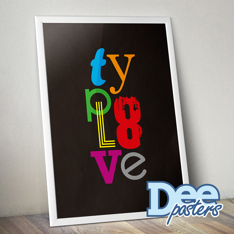
This simple design is not as complex or crisp as many of my other designs.
But I wanted it to be simple, so it was easy to decode the word and the different types used.
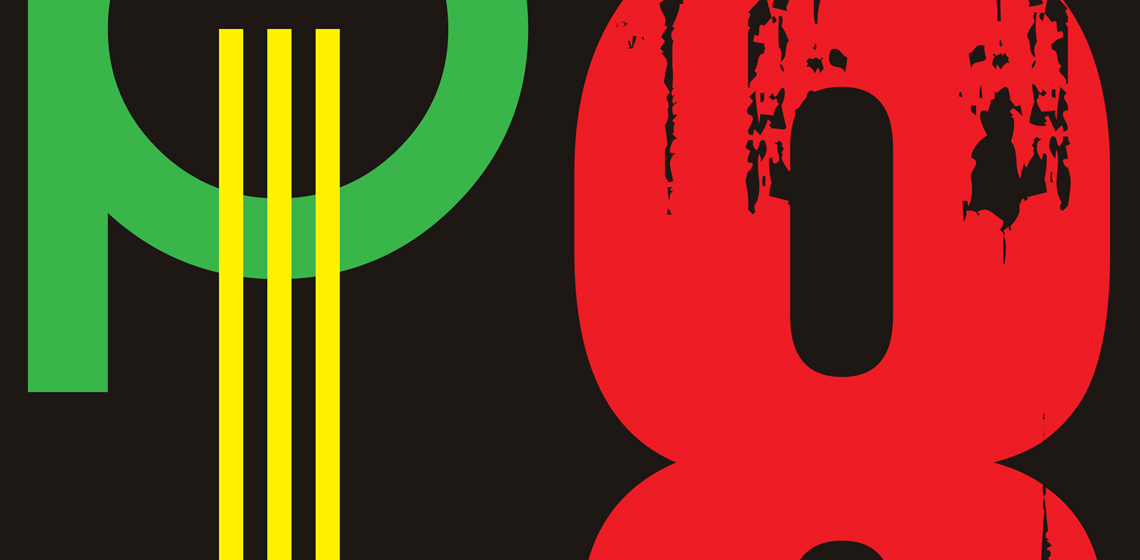
It was obvious to set the word with different types, to emphasize the message.
I also wanted it to be a bit naive and childish, so I used a lot of different colors.


