Don't be a square
This serves as a good example to what can happen if I am a bit too square.
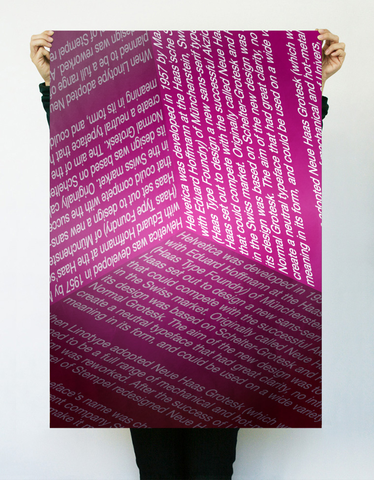
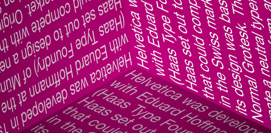
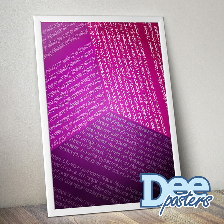
The idea with the design was very basic, to try and give the impression of depth, in a very simple way.
I decided to combine three surfaces to create the illusion of a corner of a cube.
And to begin with, it feels like you are looking at a cube, but keep looking and it starts to feel like your are standing in a room, looking at corner.


