The air that surrounds us
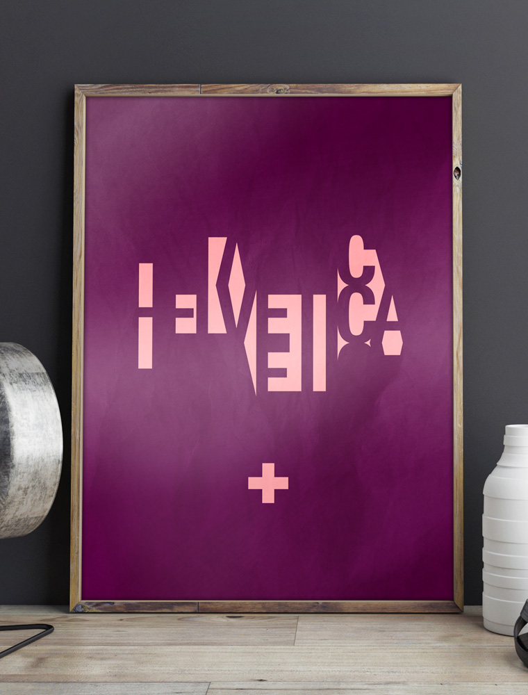
My idea with this design was to illustrate the invisible strength of typeface Helvetica, which to many is the space surrounding each character.
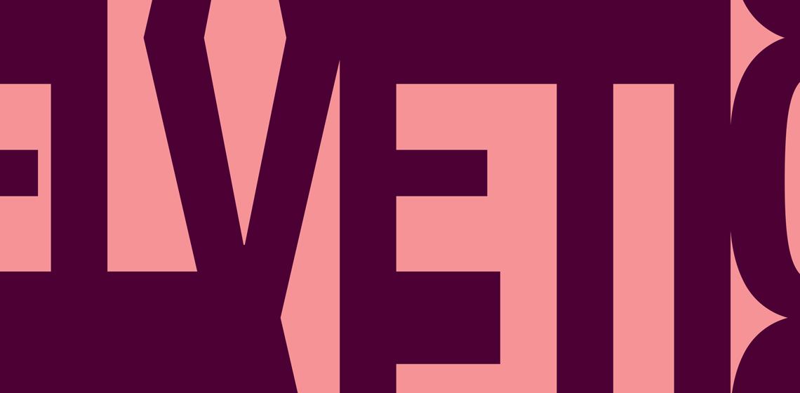
Helvetica is as much about the negative space surrounding the letters as about the lines that make up the characters themselves.
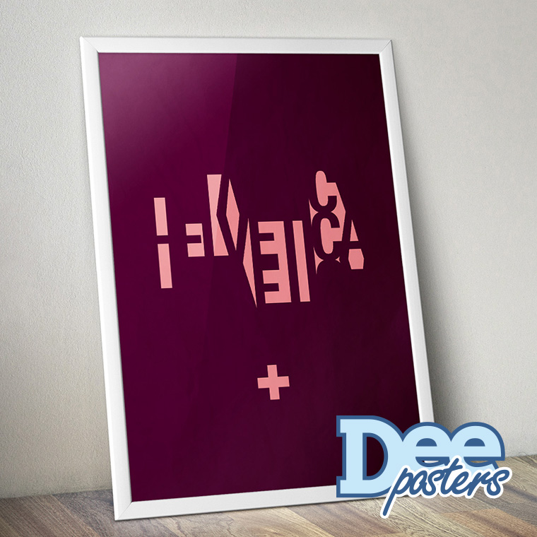
It is almost a negative print of Helvetica, which makes it a bit hard to decode at first glance, but type freaks like myself, will hopefully find it intriguing.


