From advertising agency to media house
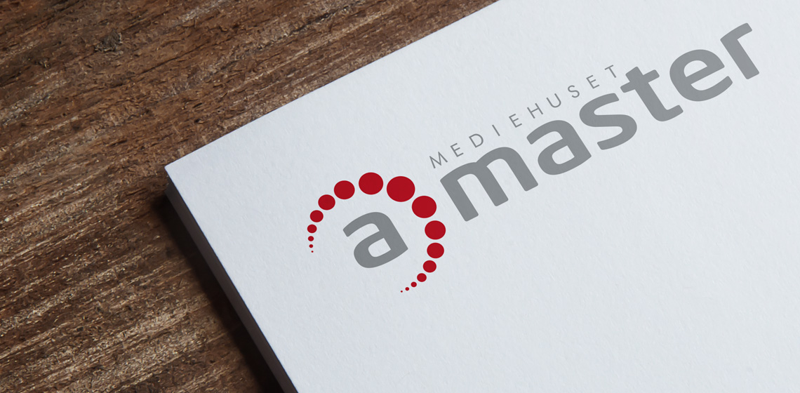
When the agency aMaster chose to give their visual identity an update, I signed up with this logo design.
The logo is based on a soft, stylish sans-serif type that helps ensure harmony and balance.
The dotted crescent symbolizes the process in the cooperation with the customer - from the first contact over a cup of coffee to the last handshake when the assignment is completed and delivered.
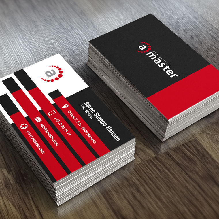
The dotted crescent is designed as a conceptual element, that can be used alone in other contexts.
The color scheme is discreet, supplemented with a powerful signal color, to create an eye-catch.


