Xcite

Xcite

X marks the spot

American company Xcite wanted a logo that was strong and powerful - a logo that expressed impact.
At the same time, the wish was that the logo was a unique identity that spoke its own language in the business.

I designed this logo where the normally sharp X is made softer by wrapping it around itself.

The name is set with typeface Helvetica, bold and wide, to establish weight to support the strength of the logo.

The color scheme is set to support the impact and identity of the logo.
The unique color scheme is designed, so that Xcite can brand themselves on the colors alone, without having to use the logo.

Xcite
Xcite
Xcite
Xcite
Xcite
Xcite

Business card and stationary

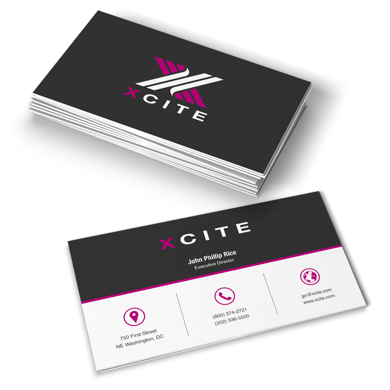
With basis in the logo, I designed business cards and stationary for Xcite.

The use of logo, colors and graphic elements are weighed closely with each media, to create an appropriate visual relation.

The layout of the different media primarily takes into account the nature and function of the media, so that it can perform its task without drowning in a graphical abundance.

Xcite

From touch point to touch point

Often, a media is just one touch point, in a wide range of multimedia. Therefore, one must often take a previous touch point onto account, in order to create a media that meets the expectations of the recipient.

Next, it must provide an added value that motivates the recipient to take action either by moving on to the next touch point or by making a purchase.

Marketing material is designed with respect for the concept and the visual expression. At the same time, it is designed to serve as a strong media that solves the task and deliver the desired result.

Xcite
Xcite
Xcite