Vaqua Water Purification Systems

Vaqua

Clean expression for clean water

Vaqua makes water purification systems for industry and agriculture. When they decided to get their visual expressions updated, they turned to me, with a request to develop a discreet logo and concept, that could work professionally in the industry.

The visual identity should be worked out in a complete concept, so that it could be used on all fronts in the company, and thus help to visually manifest Vaqua, as a professional player on the market.

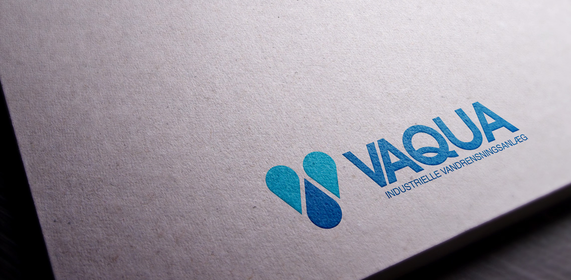
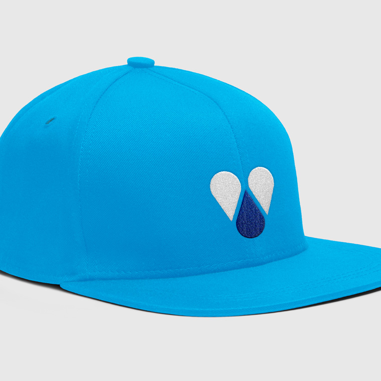
The identity is largely in the graphic element, a V built up of three drops of water. The graphic element follows the name, but can also be used alone to brand Vaqua.

The color scheme is set with two fresh blue shades, that stand well to each other and clearly signal water.

Vaqua
Vaqua
Vaqua
Vaqua
Vaqua

Business card and stationary

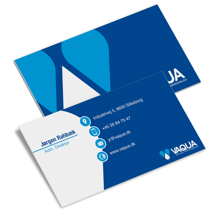
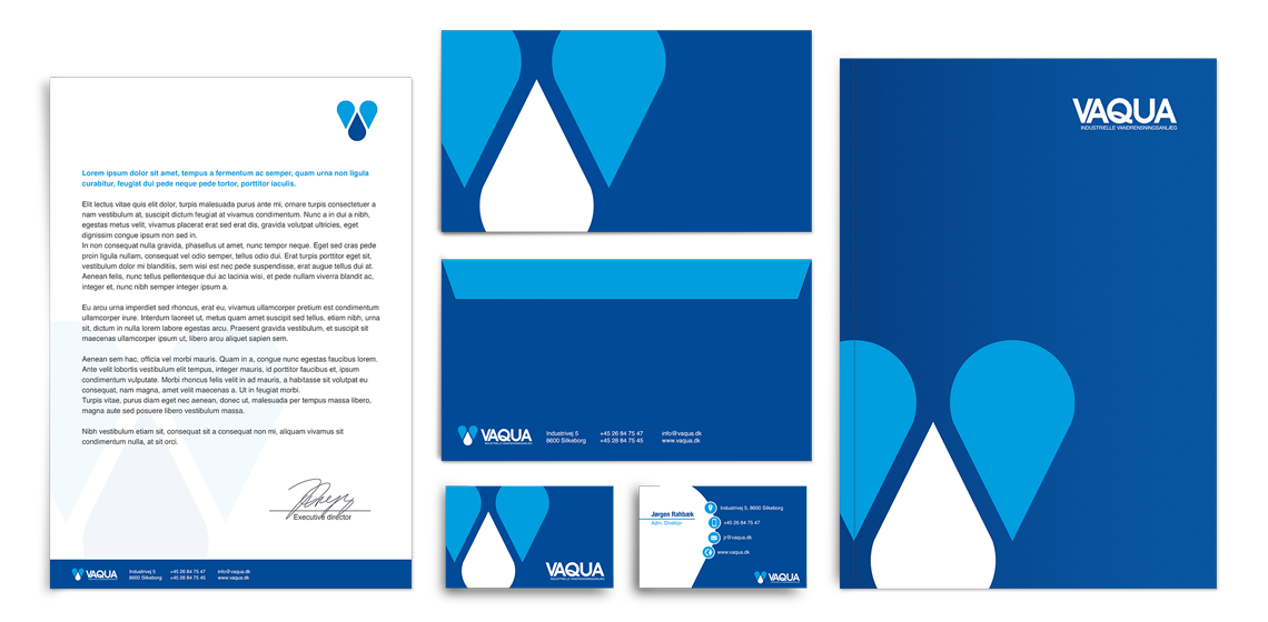
With basis in the logo, I designed business cards and stationary for Vaqua.

The use of logo, colors and graphic elements are weighed closely with each media, to create an appropriate visual relation.

The layout of the different media primarily takes into account the nature and function of the media, so that it can perform its task without drowning in a graphical abundance.

Vaqua
Vaqua
Vaqua
Vaqua

The conceptually strong brand

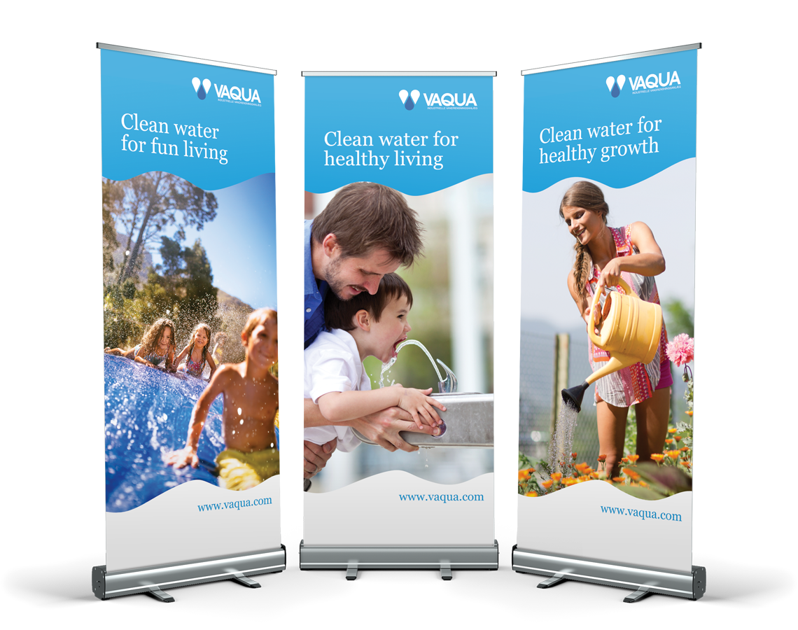
The logo forms the basis of the visual identity, which, along with colors and graphic elements, is applied to all media for print and web, to create a conceptual expression.

A media must be able to stand alone and clearly and unequivocally show who the sender is, so that each media is a strengthening of the overall concept, and contributes to the value of a recognizable visual identity and a strong brand.

Marketing material is designed with respect for the concept and the visual expression. At the same time, it is designed to serve as a strong media that solves the task and deliver the desired result.

Vaqua
Vaqua
Vaqua