Updata

Updata

Uplifting expression for Updata

Updata is a small IT company in Aalborg, where the owner Jens had designed the logo himself.
He asked me to prepare a professional proposal for him, including the proposal of business cards and stationary.

I designed this logo, where the identity largely is in the graphic element, which is a play with the word Up, which in the combination ends up visualizing an upward arrow.

The color scheme is set with two matte blue shades, that stand well to each other and the general expression in the industry.

Updata
Updata
Updata
Updata
Updata

Business card and stationary

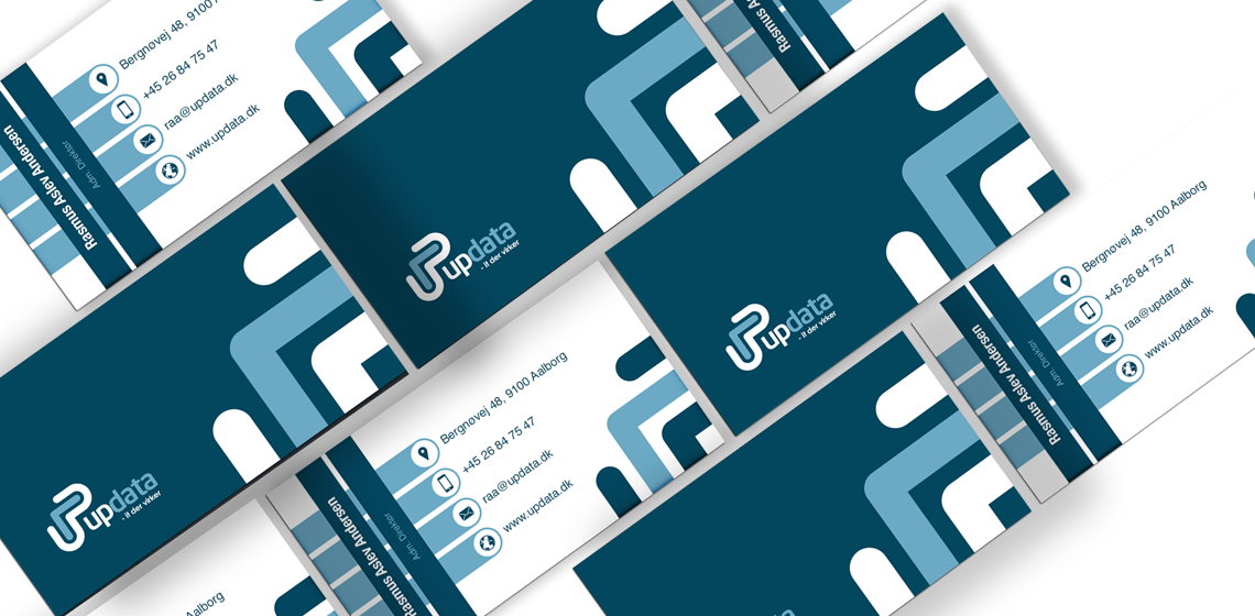
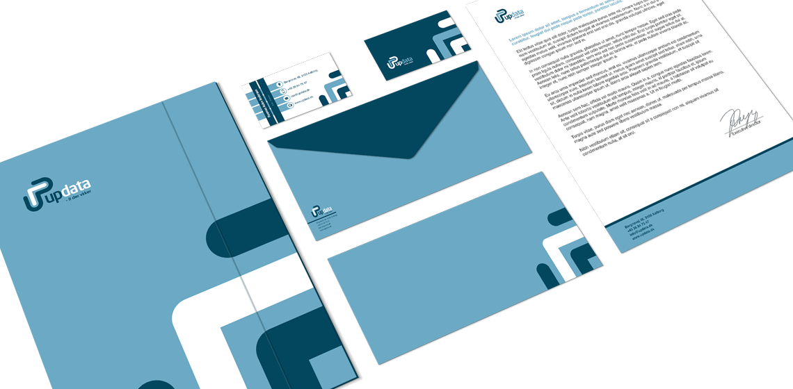
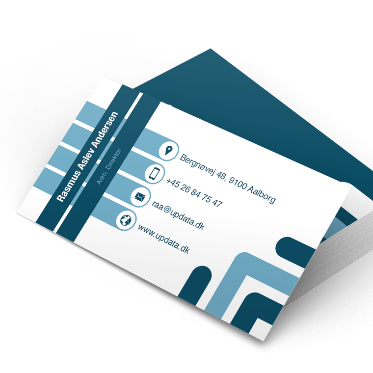
With basis in the logo, I designed business cards and stationary for Updata.

The use of logo, colors and graphic elements are weighed closely with each media, to create an appropriate visual relation.

The layout of the different media primarily takes into account the nature and function of the media, so that it can perform its task without drowning in a graphical abundance.

Updata
Updata

From touch point to touch point

Often, a media is just one touch point, in a wide range of multimedia. Therefore, one must often take a previous touch point onto account, in order to create a media that meets the expectations of the recipient.

Next, it must provide an added value that motivates the recipient to take action either by moving on to the next touch point or by making a purchase.

Marketing material is designed with respect for the concept and the visual expression. At the same time, it is designed to serve as a strong media that solves the task and deliver the desired result.