Steinmetz

Steinmetz

Sharpness and precision for Steinmetz

When the online-based news media Steinmetz were about to go online, they expressed a desire to get a strong and recognizable logo.

It was important that the name was set with an easy-to-read type, so that it was easy to brand the name Steinmetz.

I designed this logo set with typeface Gill Sans.
To create a unique visual expression, I added a red triangle that intersects the name and helps signal sharpness and precision.

Steinmetz
Steinmetz
Steinmetz
Steinmetz
Steinmetz
Steinmetz

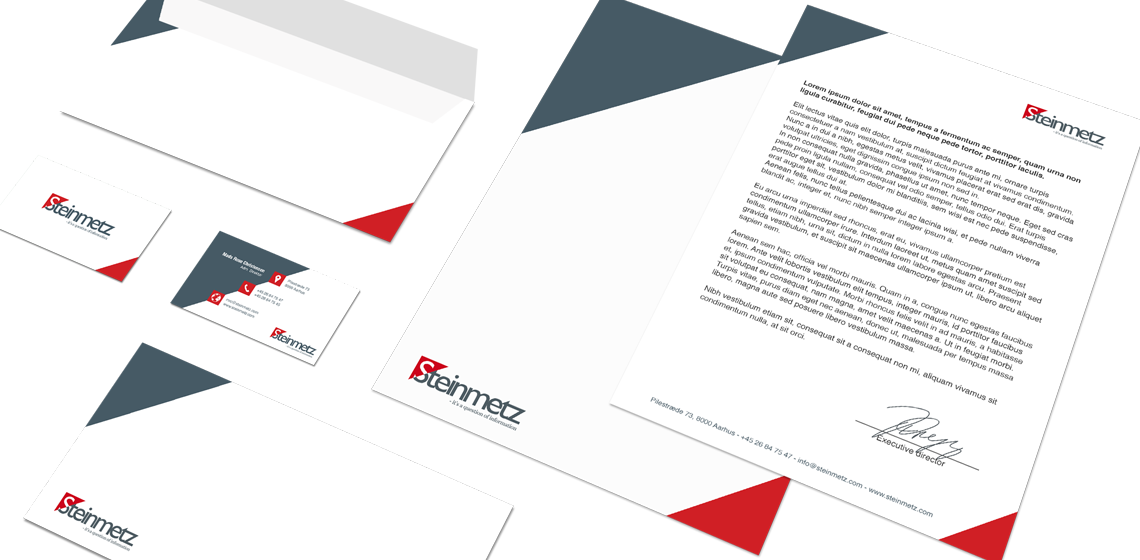
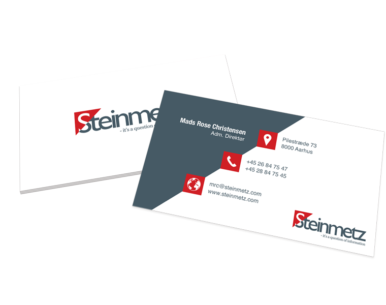
Business card and stationary

With basis in the logo, I designed business cards and stationary for Steinmetz.

The use of logo, colors and graphic elements are weighed closely with each media, to create an appropriate visual relation.

The layout of the different media primarily takes into account the nature and function of the media, so that it can perform its task without drowning in a graphical abundance.