Soeco

Soeco

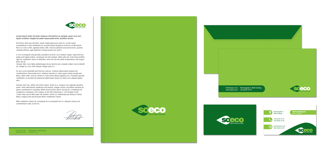
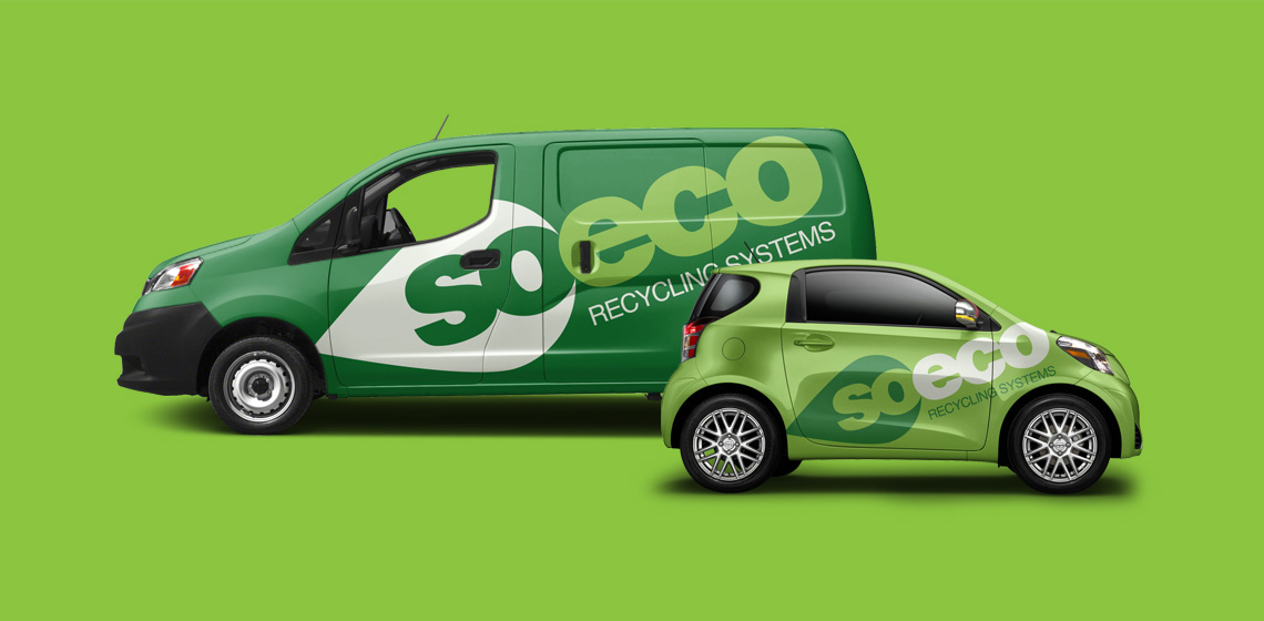
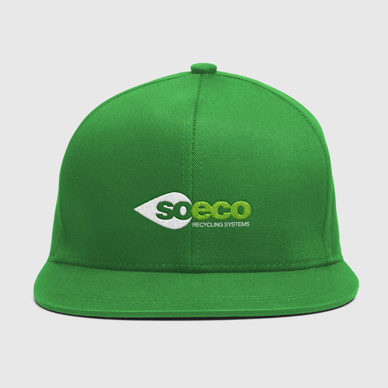
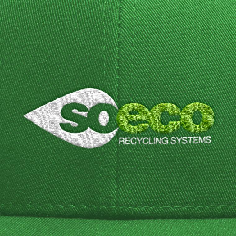
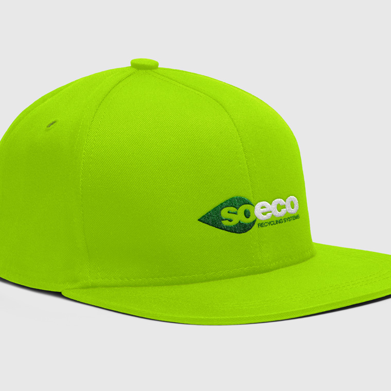
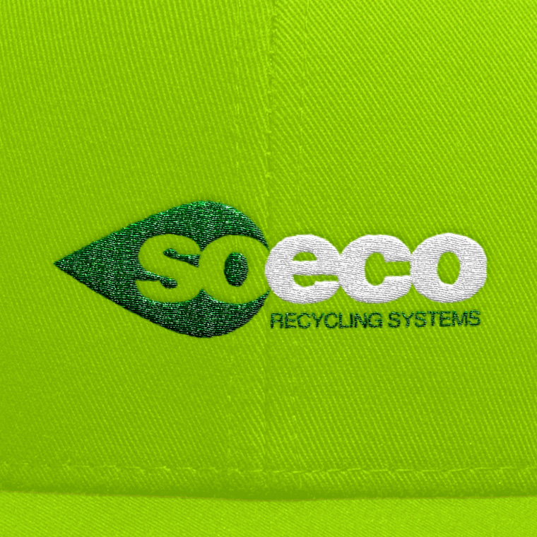
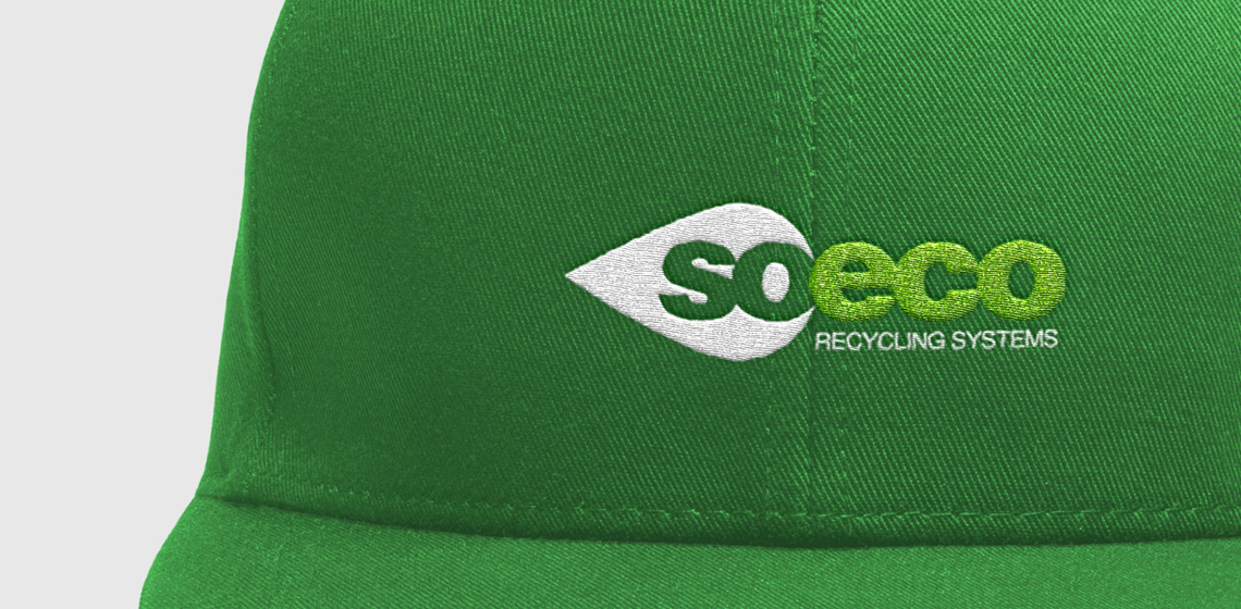
Sustainable logo for Soeco

Soeco makes recycling systems, primarily for sorting waste.

The task was to create a logo with a green and environmental feel to it.

I designed this logo set with typeface Helvetica, and supplemented it with a graphic element in the form of a drop/leaf, that not only helps create a unique identity, but also gives the logo dynamic momentum.

The color scheme is set with green shades, to support the environmentally-friendly work.

Soeco
Soeco
Soeco
Soeco
Soeco

Business card and stationary

With basis in the logo, I designed business cards and stationary for Soeco.

The use of logo, colors and graphic elements are weighed closely with each media, to create an appropriate visual relation.

The layout of the different media primarily takes into account the nature and function of the media, so that it can perform its task without drowning in a graphical abundance.

Soeco
Soeco
Soeco

From touch point to touch point

Often, a media is just one touch point, in a wide range of multimedia. Therefore, one must often take a previous touch point onto account, in order to create a media that meets the expectations of the recipient.

Next, it must provide an added value that motivates the recipient to take action either by moving on to the next touch point or by making a purchase.

Marketing material is designed with respect for the concept and the visual expression. At the same time, it is designed to serve as a strong media that solves the task and deliver the desired result.

Soeco
Soeco

The conceptually strong brand

The logo forms the basis of the visual identity, which, along with colors and graphic elements, is applied to all media for print and web, to create a conceptual expression.

A media must be able to stand alone and clearly and unequivocally show who the sender is, so that each media is a strengthening of the overall concept, and contributes to the value of a recognizable visual identity and a strong brand.

Soeco
Soeco
Soeco