Razor sharp identity for Samurai
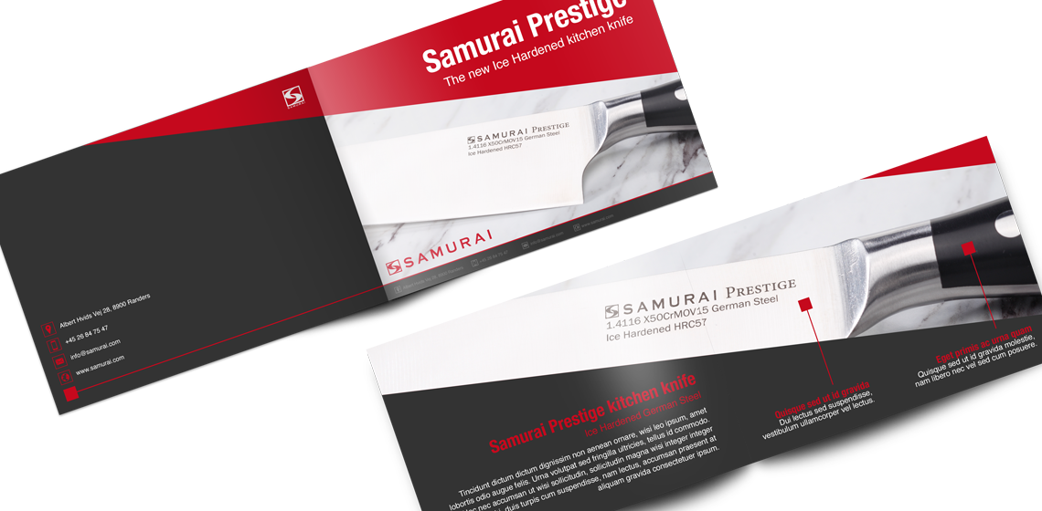
When Samurai in Randers approached me, they wanted me to develop a visual concept,
that could brand them as a manufacturer of high quality kitchen blades.
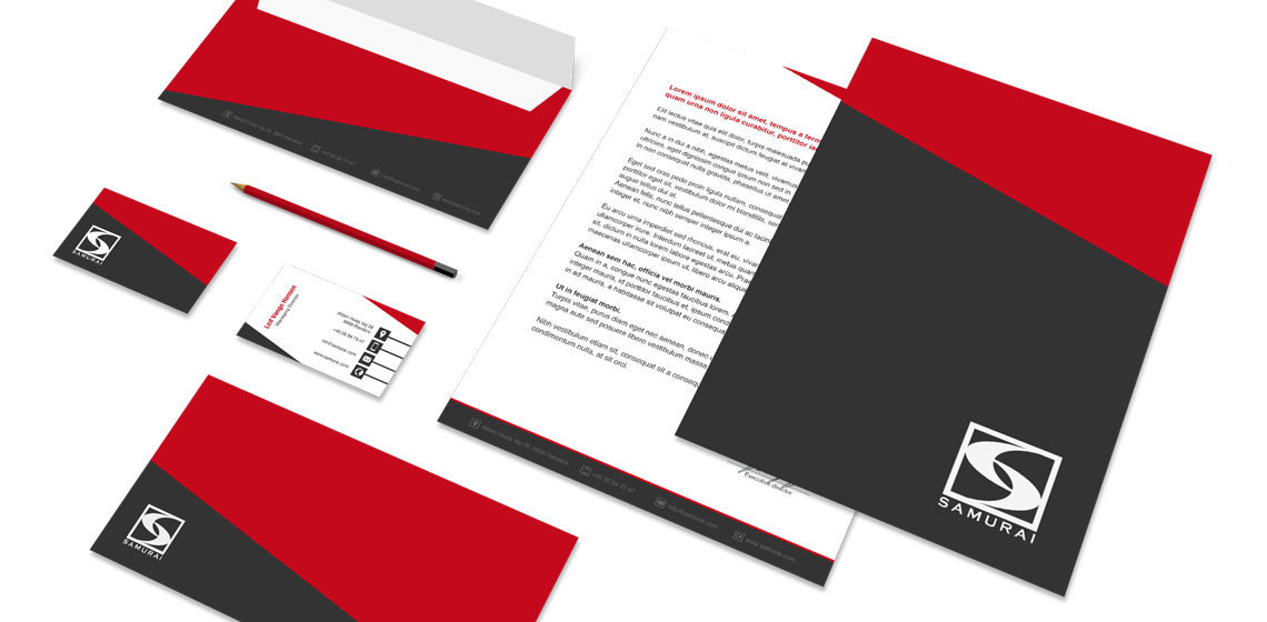
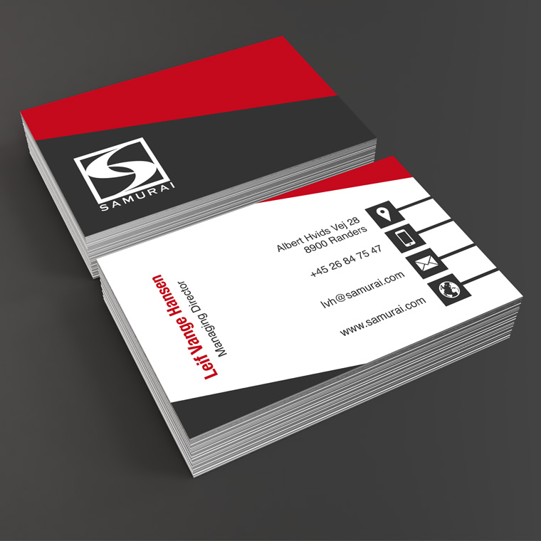
I designed this logo, where the identity lies in the unique S, designed with inspiration from caligraphy, with reference to the Japanese in the name of Samurai.
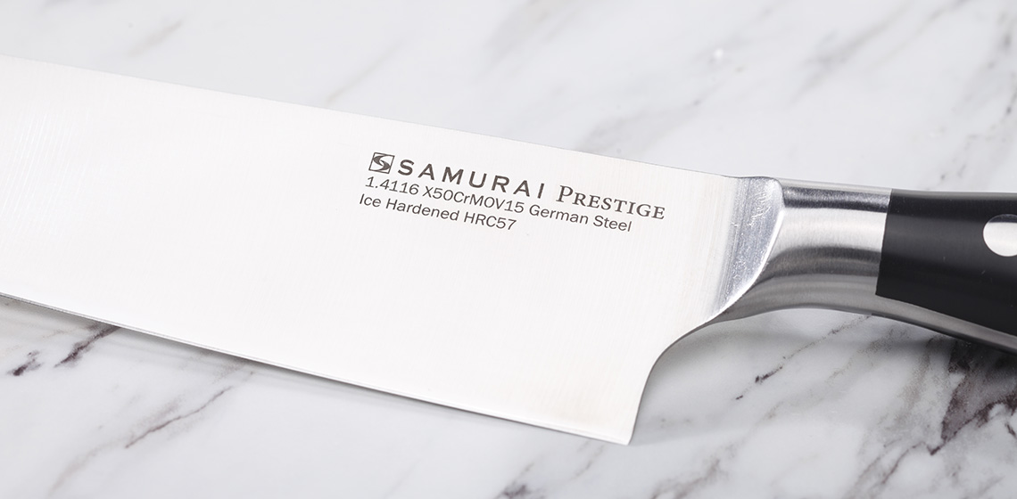
The logo was designed in one color, so it could be easily and clearly reproduced on Samurais knives.


