Sliced logo design with gravity
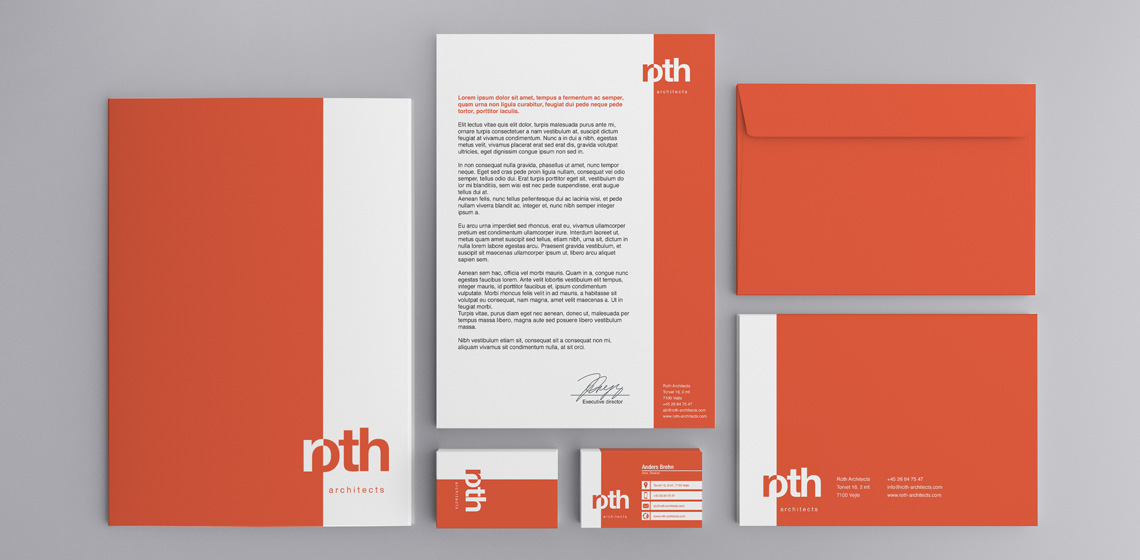
Roth Architects wanted a logo that had weight, but at the same time it should be a simple and elegant expression.
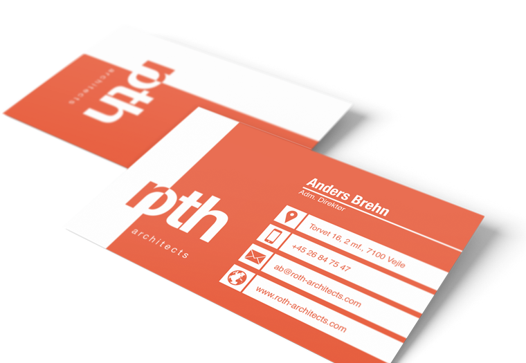
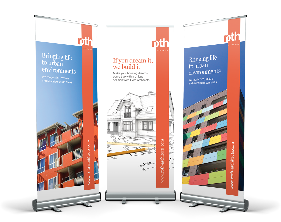
I designed this logo where the identity lies in the design of the name and the shape it works in.
The name is set with typeface Helvetica, and put in a shape that intersects the name in two.
The square shape helps to establish weight, but it also helps to express Roth Architect's work with shapes and construction.
The color scheme is fresh and young, but without being flashy.


