Logo that quotes you
When a group of young guys wanted to create a new magazine for young people, they contacted me for help with both the choice of name and the design of a logo.
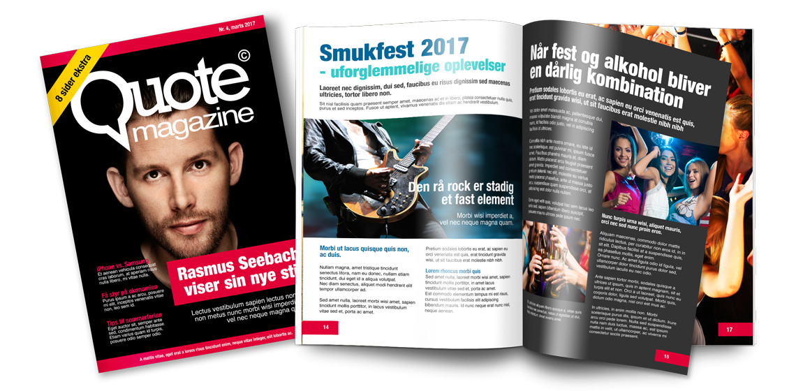
After we had worked out that the magazine was to be called Quote Magazine, the task was to design a logo that should not be a corporate logo, yet unique to create recognisability.
At the same time, the logo should have substance and strength, in order to get branded well into the mentality of young people.
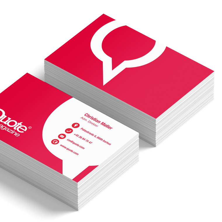
I designed this logo with a bold slab-serif type and designed a new Q that illustrates a speech bubble.
The color scheme has a strong red as the primary color, to maximize the effect in the target audience, and to support the intended content of Quote Magazine.


