Discreet and conservative visual identity to Puc+Udecker
When German Puc+Udecker decided to get a new visual identity, they approached me with the task.
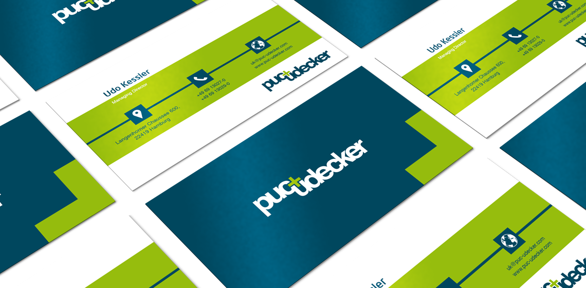
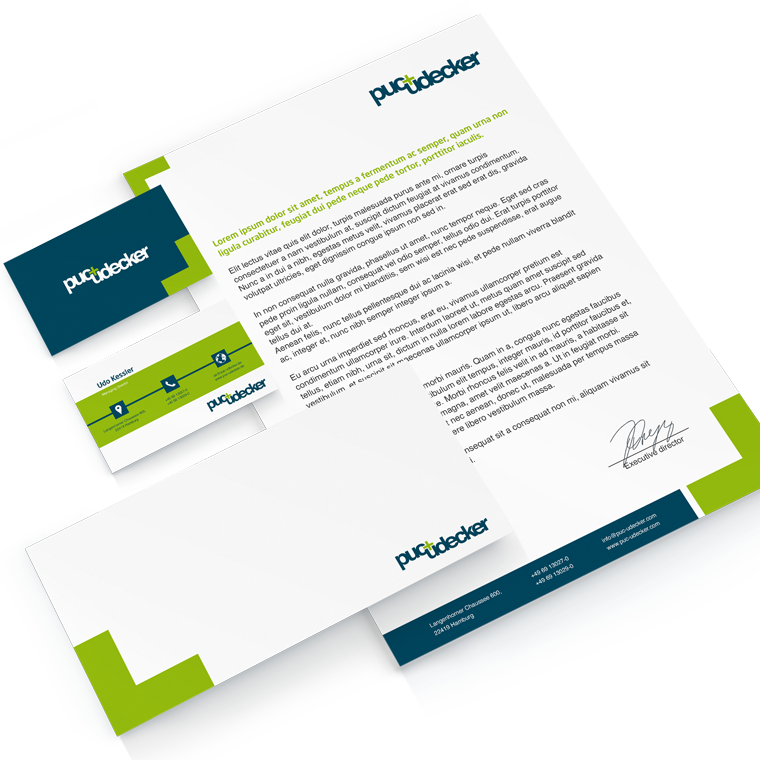
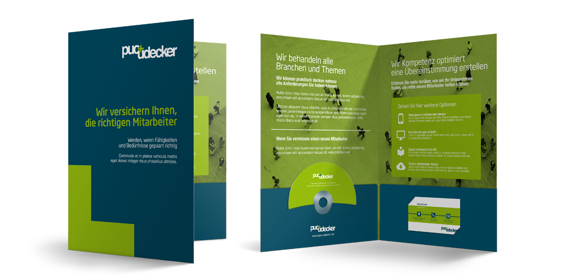
The wish was to get a discreet and conservative concept, that could elegantly brand the company.
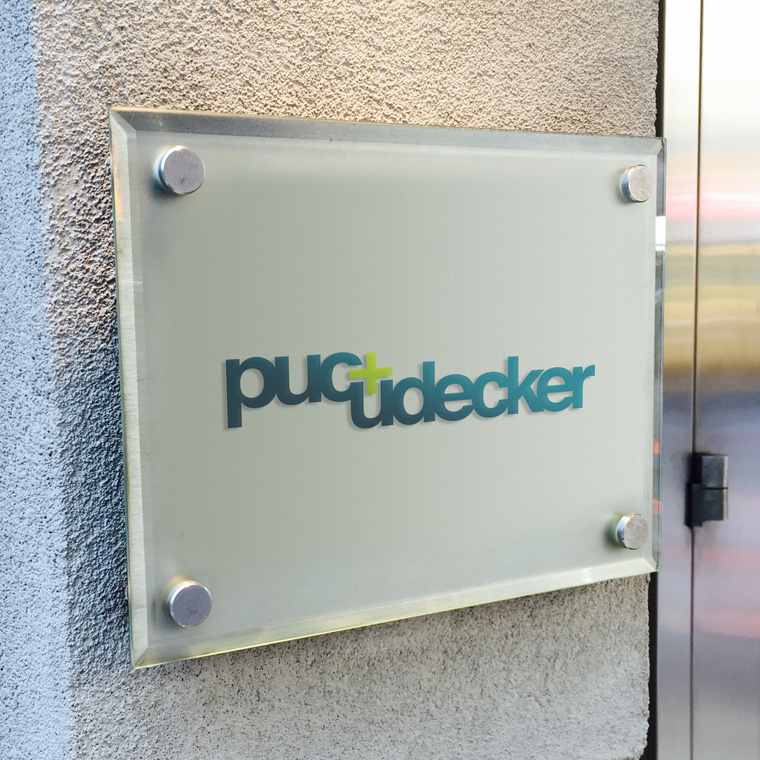
I designed this logo that is set in bold with typeface Helvetica.
The two names are associated with a +, which stands out in a contrast color.
It is largely the discrete + that creates the identity, and it establishes a fix point in the logo.
I designed the logo for Puc+Udecker as a part of a larger conceptual assignment, where I also designed Puc+Udecker's website and newsletter.
