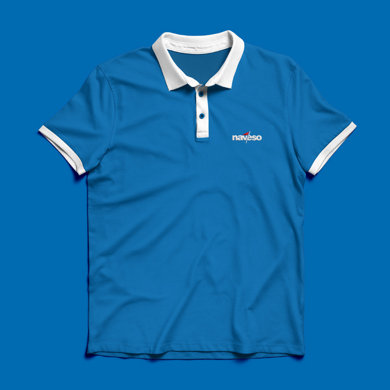
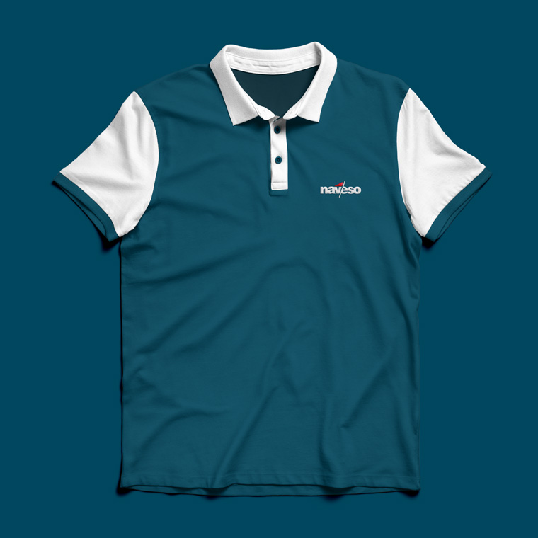
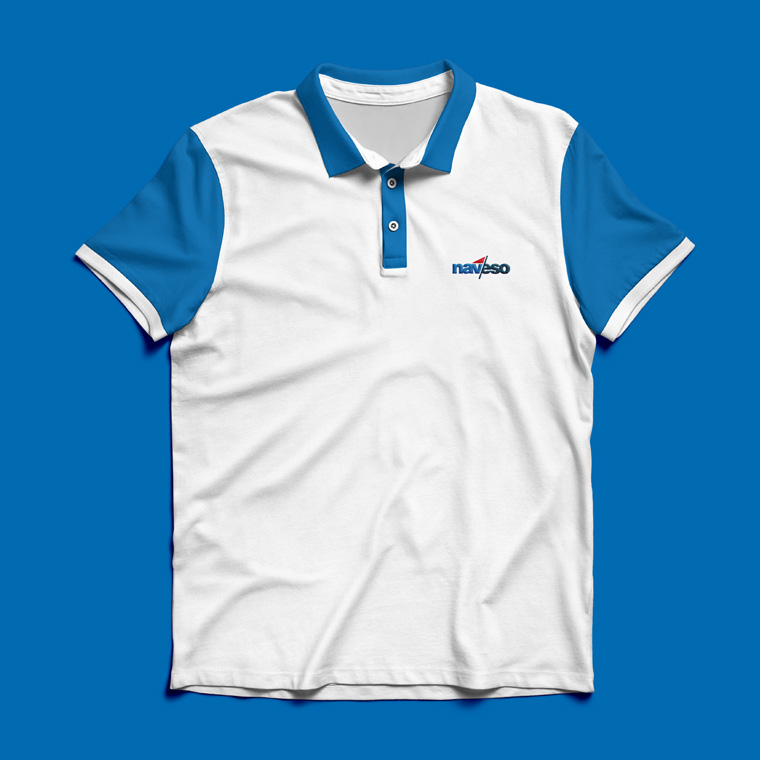
At sea with a new logo for Naveso
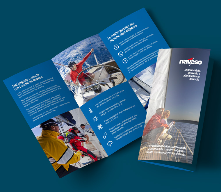
The Italian company Naveso makes clothing and equipment for maritime use.
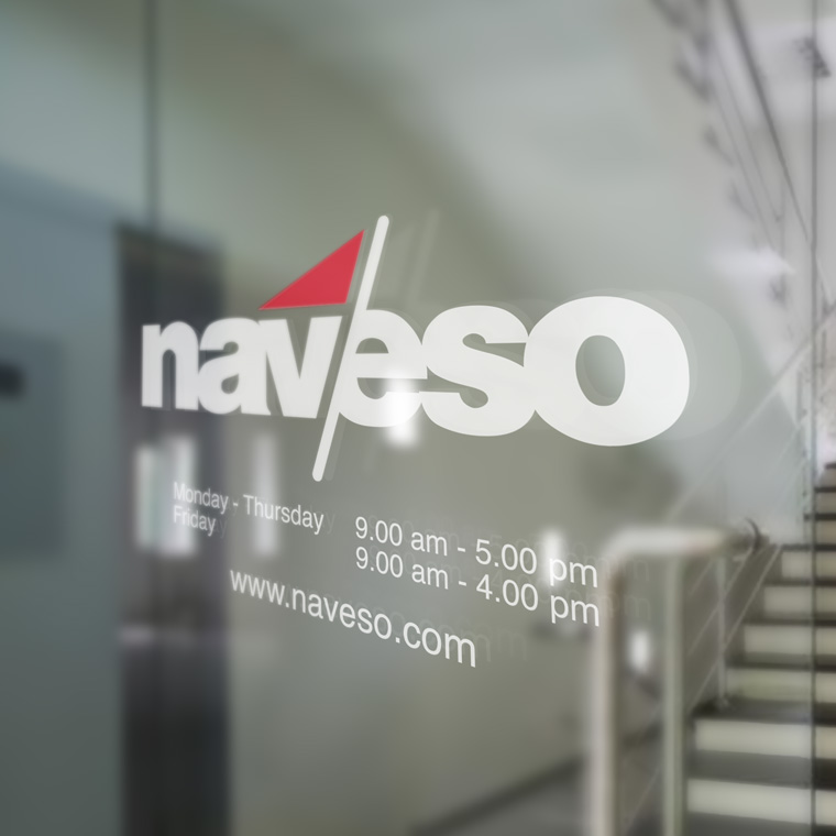
When they decided to get a new logo, they addressed me with the task.
The wish was a logo with clear maritime expression, but without being constructed and complicated.
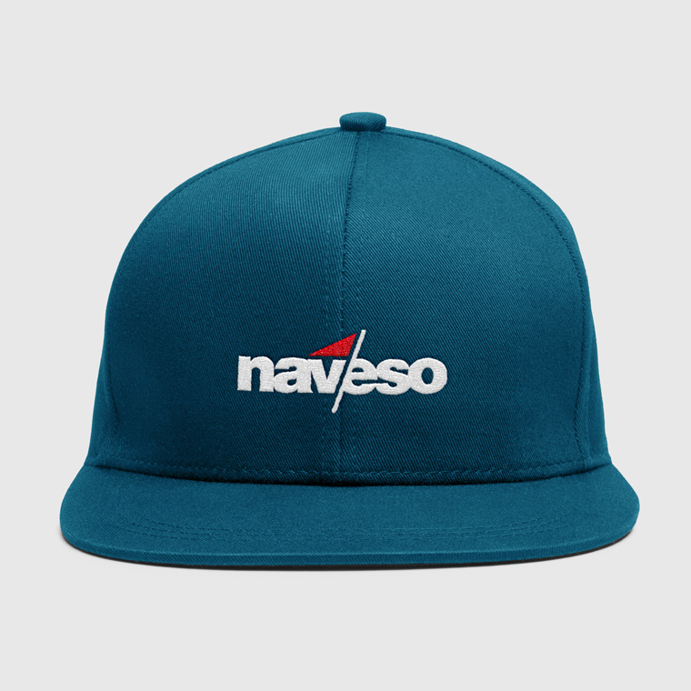
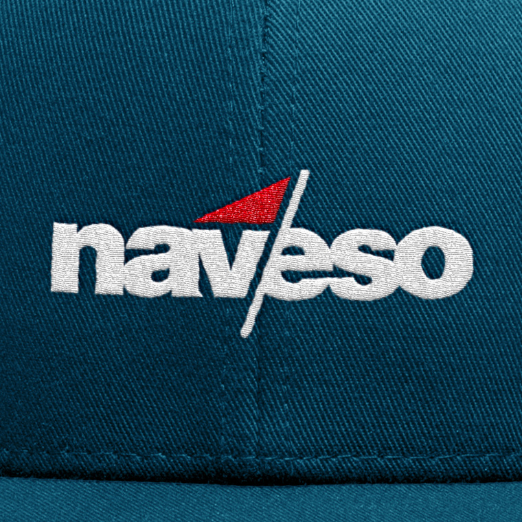
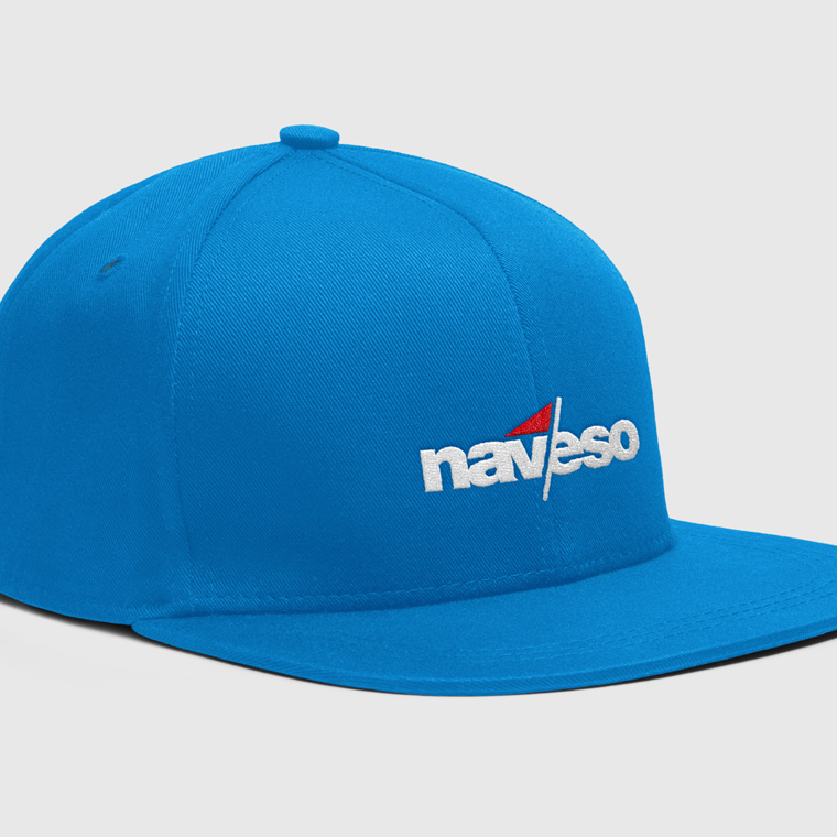
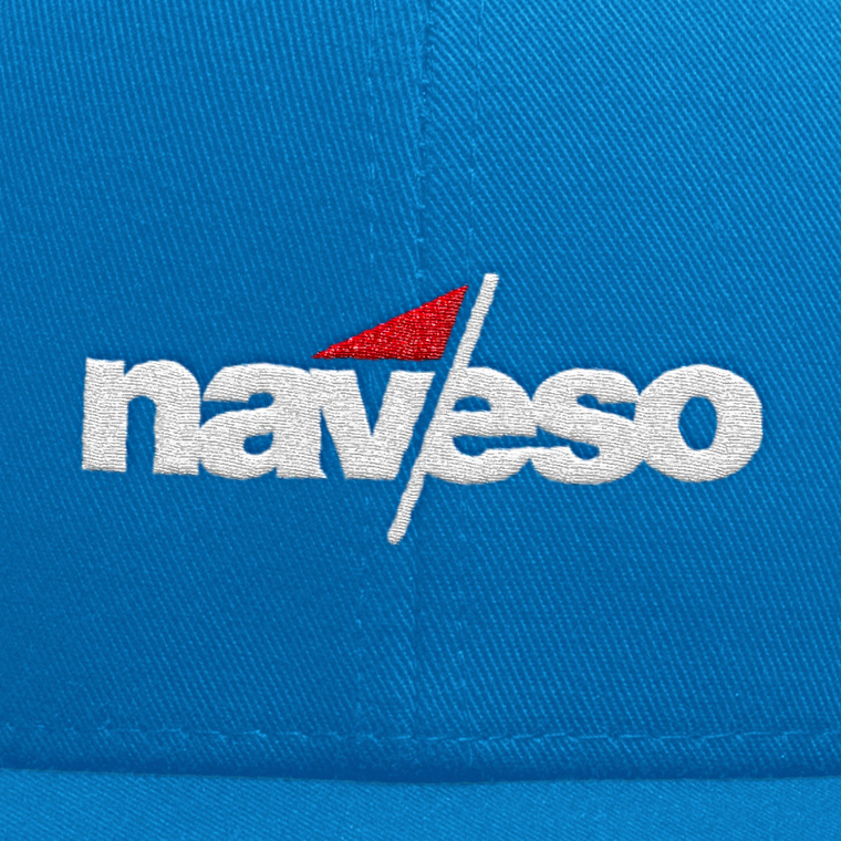
I designed this logo that is set in bold with typeface Helvetica.
The identity is largely in the the overlap in the name and in the graphic element that helps to break the name in the overlap. The graphic element also expresses the maritime aspect.
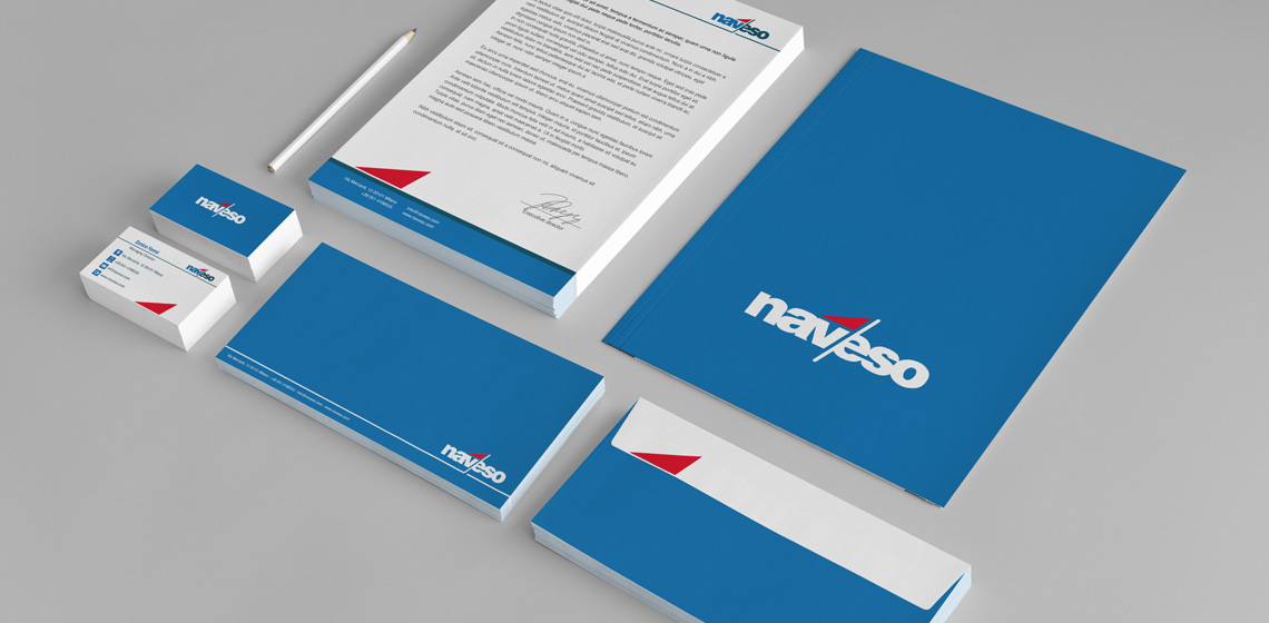
The color scheme is set with blue shades, with a powerful red signal color as contrast that helps create a fix point in the logo.


