May+Ewers Medicals

May+Ewers

Discreet identity for May+Ewers

The small American company May + Ewers, specializes in the development of durable and high-tollerance equipment for laboratories.

They wanted a discrete and simple expression that was easy to decode but still a strong identity.
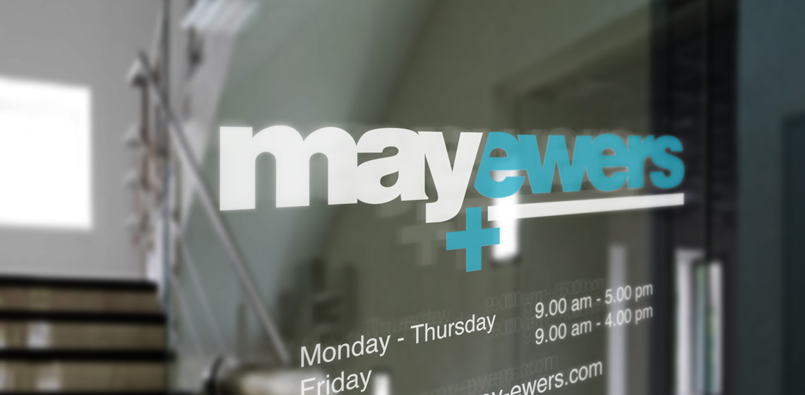
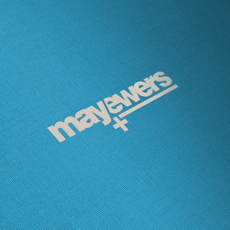
I designed this logo that is set in bold with typeface Helvetica.

The identity is largely in the overlap of the two names, and in the offset + that helps create a fix point in the logo.

The color scheme is set with blue shades, to support the medical expression.

I designed the logo for May+Ewers as part of a larger conceptual assignment, where I also designed newsletter, businesscard and stationary.

May+Ewers
May+Ewers
May+Ewers
May+Ewers
May+Ewers

Business card and stationary

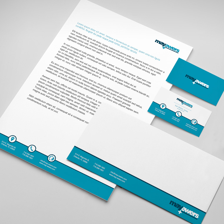
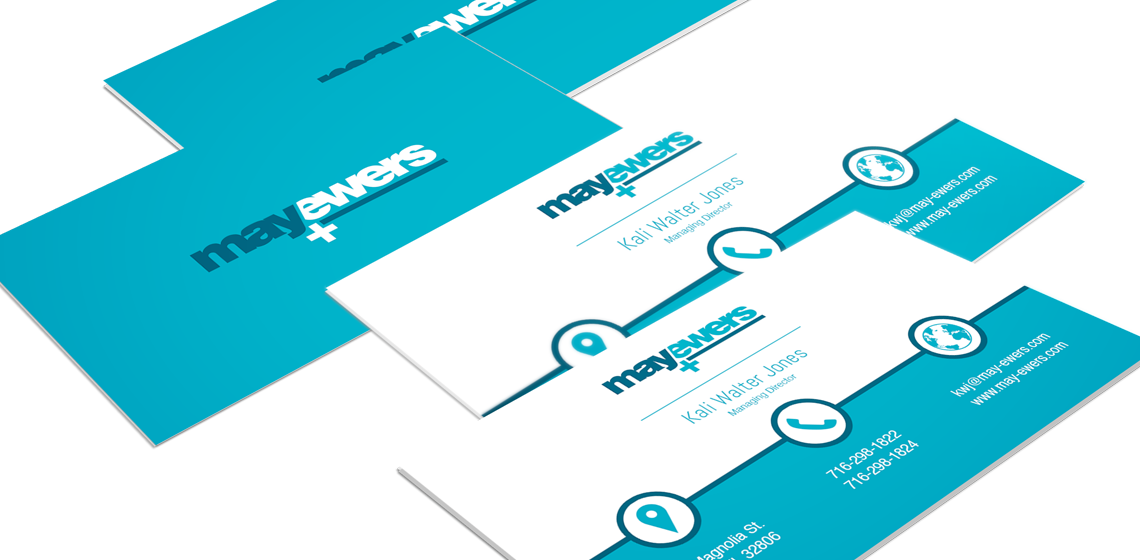
With basis in the logo, I designed business cards and stationary for May+Ewers.

The use of logo, colors and graphic elements are weighed closely with each media, to create an appropriate visual relation.

The layout of the different media primarily takes into account the nature and function of the media, so that it can perform its task without drowning in a graphical abundance.

May+Ewers

From touch point to touch point

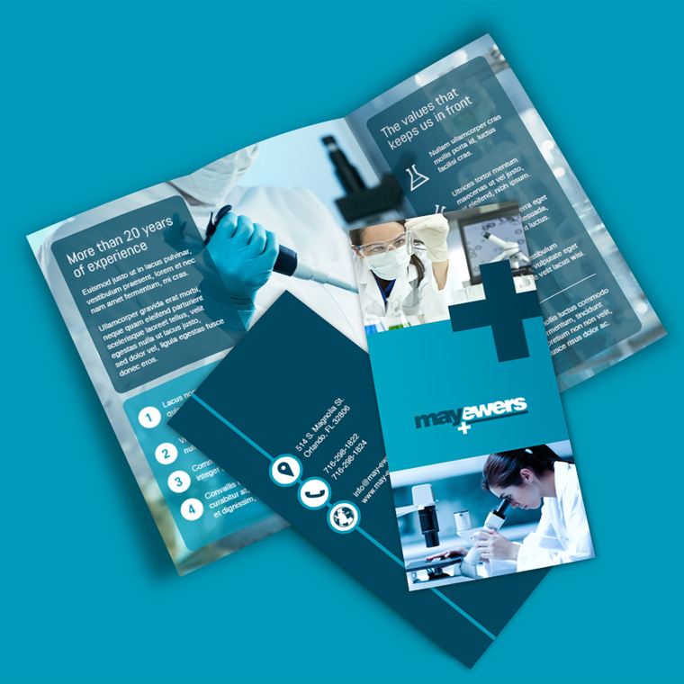
Often, a media is just one touch point, in a wide range of multimedia. Therefore, one must often take a previous touch point onto account, in order to create a media that meets the expectations of the recipient.

Next, it must provide an added value that motivates the recipient to take action either by moving on to the next touch point or by making a purchase.

Marketing material is designed with respect for the concept and the visual expression. At the same time, it is designed to serve as a strong media that solves the task and deliver the desired result.

May+Ewers
May+Ewers
May+Ewers
May+Ewers