Matsushita Electronics

Matsushita

When negative has positive effect

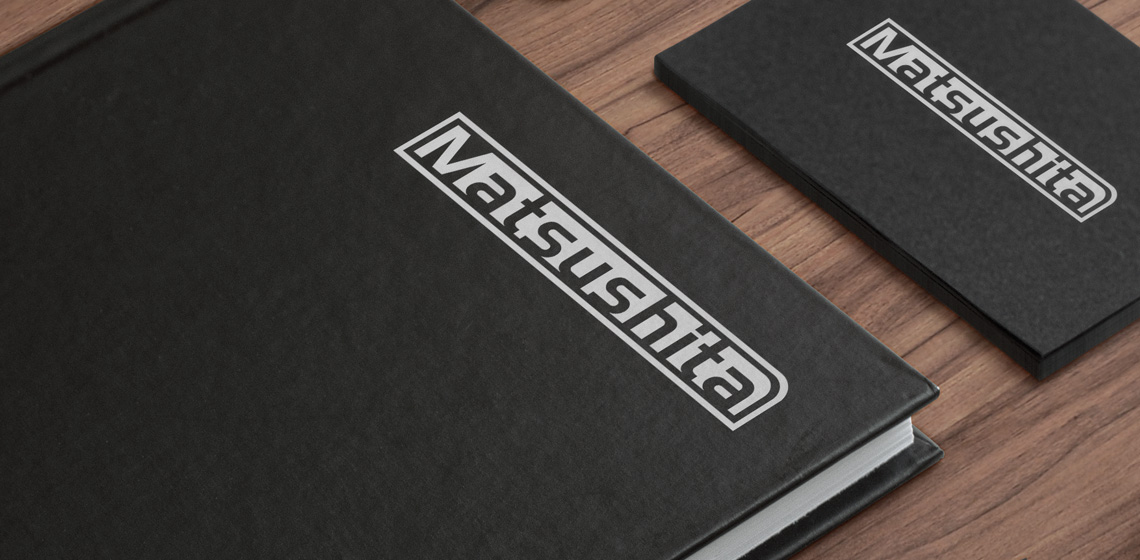
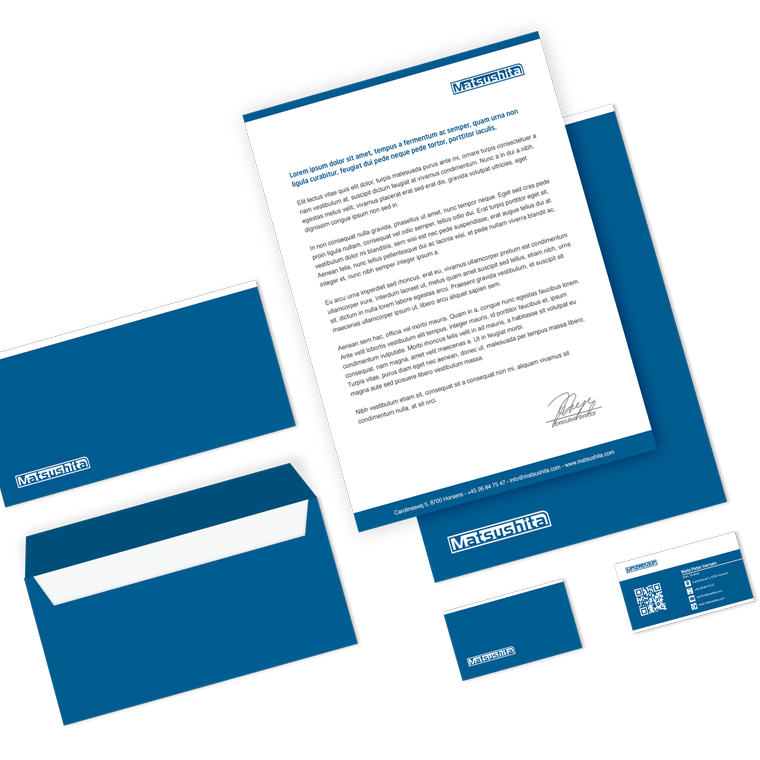
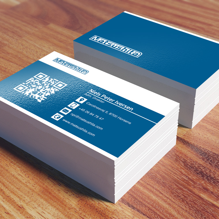
The logo for Matsushita was designed as a part of a larger conceptual assignment, where I also designed the newsletter, businesscard and stationary.

The task was to design a strong visual brand - a logo with a technical feel to it, without making it too advanced.

I designed this logo that uses a positive/negative effect to create the identity.

I chose to use a soft, stylish sans-serif type that helps ensure harmony and balance.
In order to ensure optimum decoding of the logo in all situations, I chose an extra wide distance between each character.

Matsushita
Matsushita
Matsushita
Matsushita
Matsushita

The global brand

Matsushita was already established as a global company, with markets in most of the world. Certain elements were therefore determined in advance, including the color scheme.
But besides that, I had free hands in terms of typography, graphic elements and layout, in building a visual identity.

The use of logo, colors and graphic elements are weighed closely with each media, to create an appropriate visual relation.

The layout of the different media primarily takes into account the nature and function of the media, so that it can perform its task without drowning in a graphical abundance.

A media must be able to stand alone and clearly and unequivocally show who the sender is, so that each media is a strengthening of the overall concept, and contributes to the value of a recognizable visual identity and a strong brand.

Matsushita
Matsushita
Matsushita