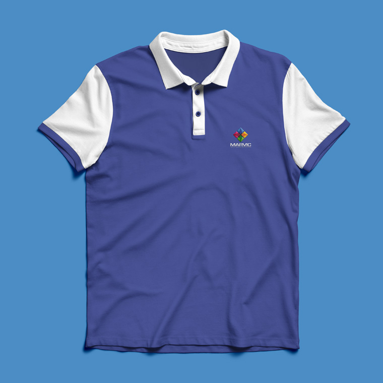
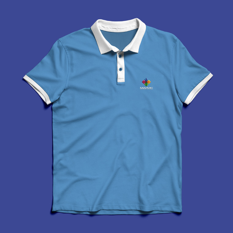
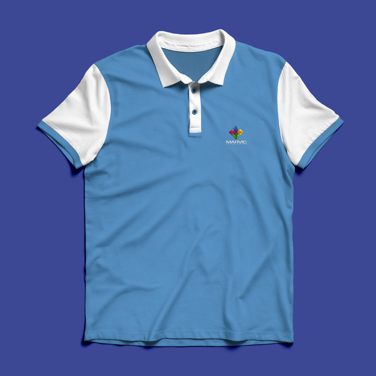
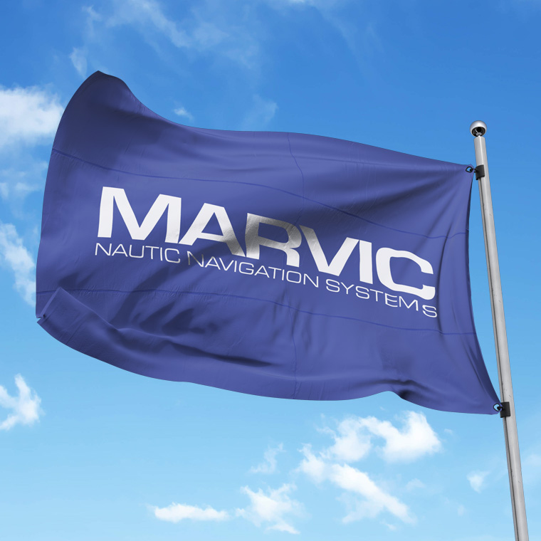
New logo sends Marvic on the right course
When Marvic International addressed a task on the design of a new logo, it was with a wish to get a contemporary and modern expression, in relation to the old logo the company had used for more than ten years.
In addition, it was imperative that the logo had a maritime and/or navigational expression.
I designed this logo set with a stringent modern type.
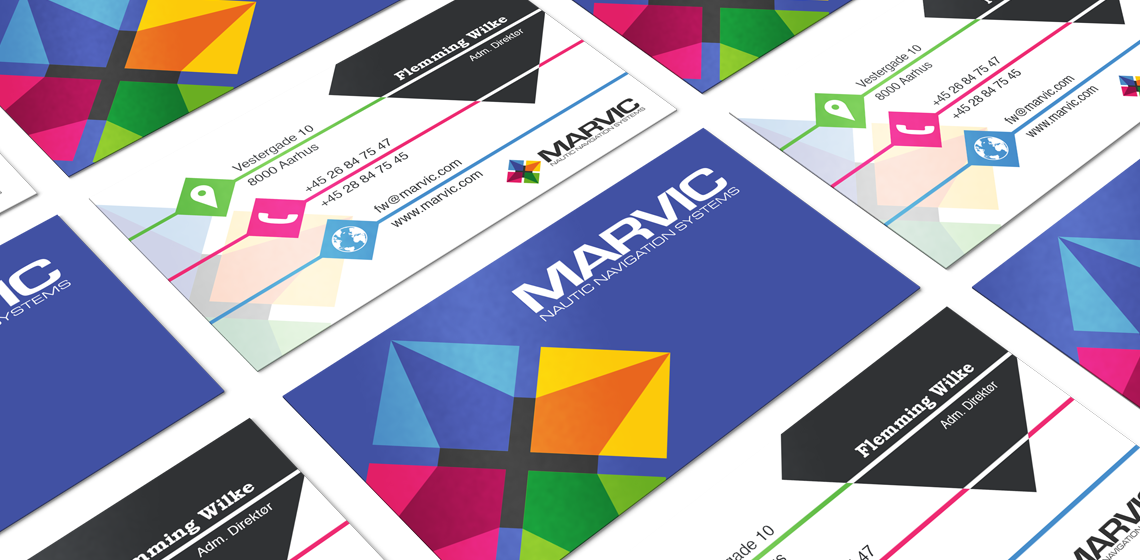
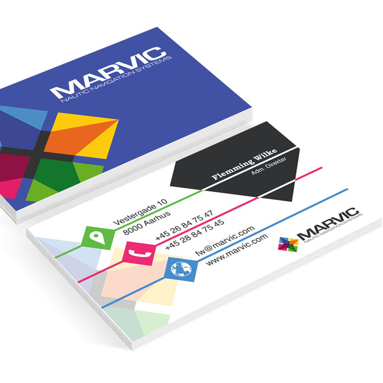
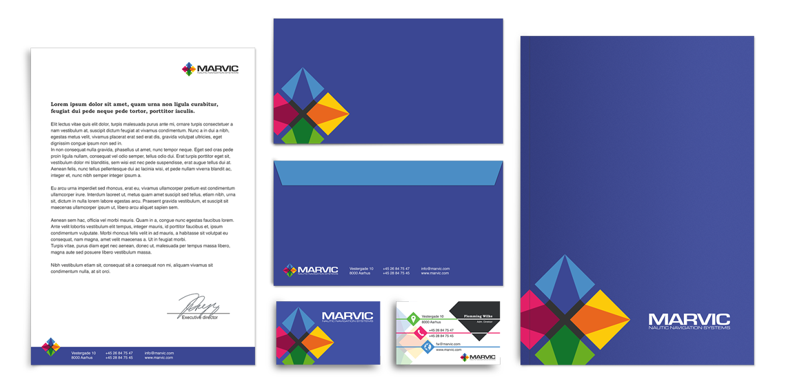
In addition, I designed a graphic element that, in a simple and elegant way, illustrates a compass.
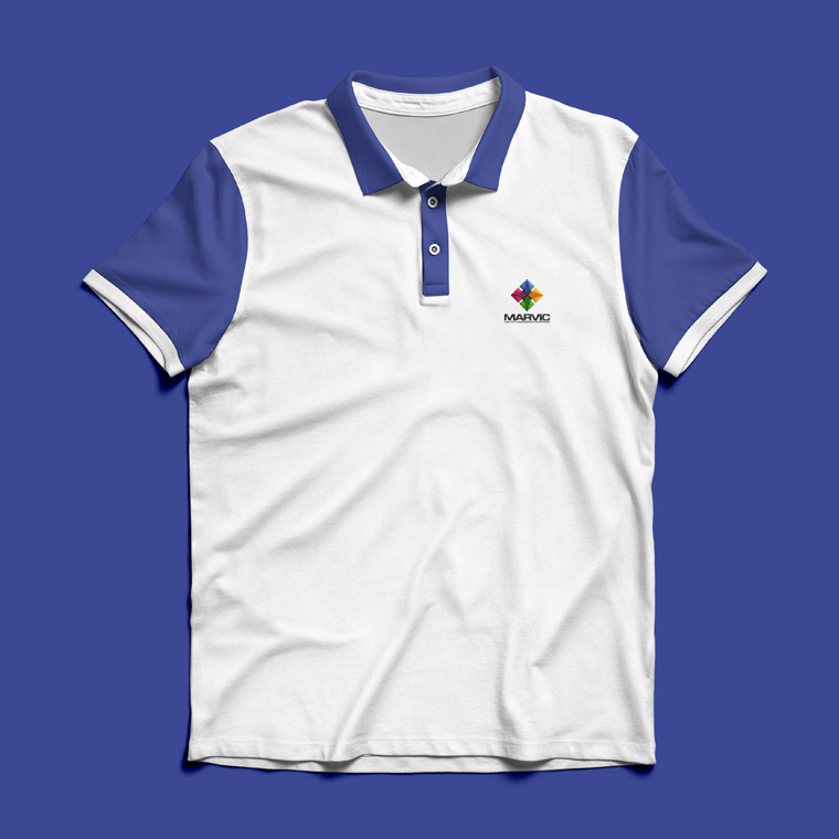
The graphic element goes together with the name, but it can also be used alone to brand Marvic.
The color scheme is set with four powerful signal colors for the graphical element, to underline the diversity a solutions from Marvic offers.


