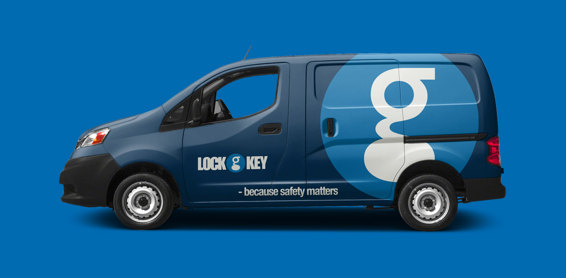
Lock&Key

Lock&Key

Security is key

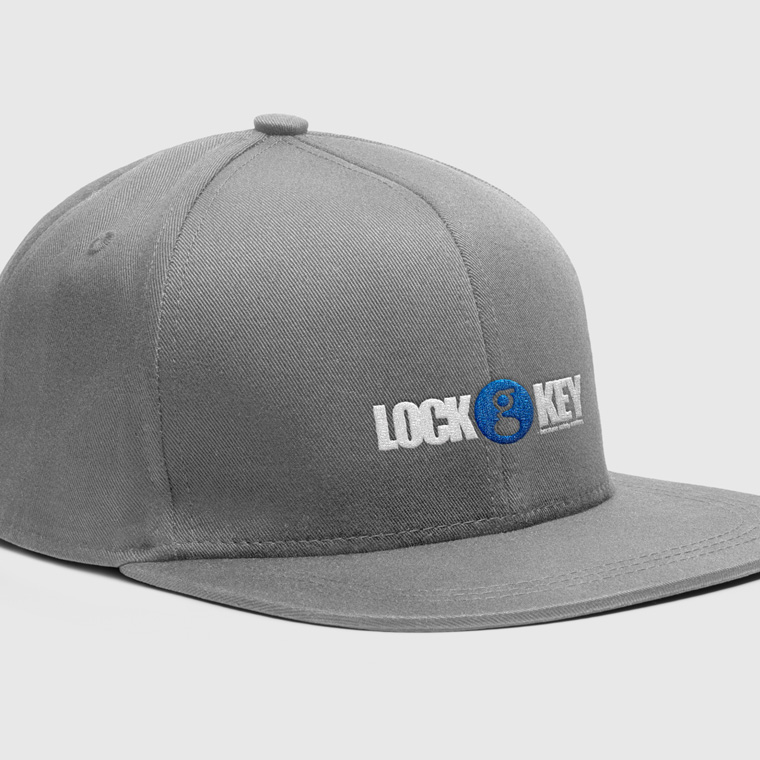
I designed the logo for Lock&Key as part of a larger assignment.

With the design of the logo, the task was to create an identity that was professionally credible, while at the same time being a strong and easily recognizable identity.

A large part of the identity lies in the keyhole, which is an element that can be used alone to brand Lock&Key.
The rest of the logo was designed with a bold sans-serif type, partly as a contrast, and partly to give the logo weight.

The color scheme is set in dark blue shades, to underline the professional credibility.

Lock&Key
Lock&Key
Lock&Key
Lock&Key
Lock&Key
Lock&Key
Lock&Key

The conceptually strong brand

The logo forms the basis of the visual identity, which, along with colors and graphic elements, is applied to all media for print and web, to create a conceptual expression.

The use of logo, colors and graphic elements are weighed closely with each media, to create an appropriate visual relation.

The layout of the different media primarily takes into account the nature and function of the media, so that it can perform its task without drowning in a graphical abundance.

A media must be able to stand alone and clearly and unequivocally show who the sender is, so that each media is a strengthening of the overall concept, and contributes to the value of a recognizable visual identity and a strong brand.

Lock&Key
Lock&Key
Lock&Key