Hoffman

Hoffman

Precise concept for accurate measurement

Hoffman Land Surveyors had for many years been worked with the same logo and visual identity, that didn't say much about who they were or what they were doing. I offered them to make a non-binding presentation on a new logo and visual concept.

I designed this logo set with a bold bastant type, to create an expression that was harmonious with the industry, and the scale and weight in Hoffman's work.

The identity of the logo is largely in the H, designed with a marker post, to provide a clear reference to Hoffman's land survey work.
The dotted marker post is a graphic element, that can be used alone to brand Hoffman.

Hoffman
Hoffman
Hoffman
Hoffman
Hoffman

Business card and stationary

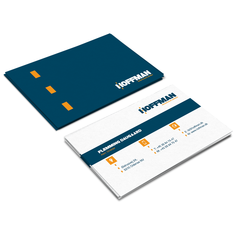
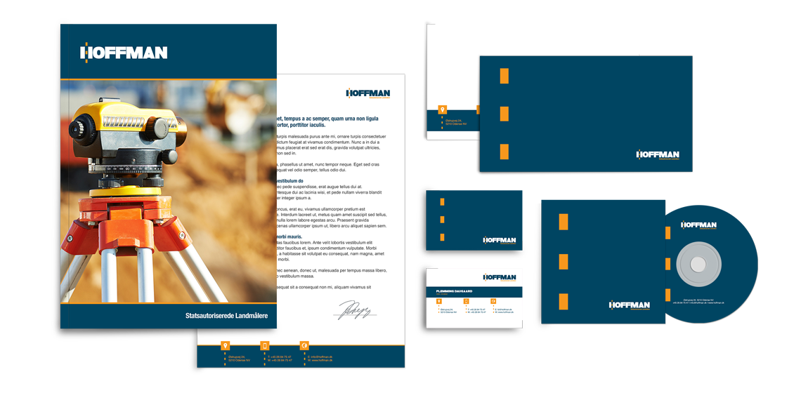
With basis in the logo, I designed business cards and stationary for Hoffman.

The use of logo, colors and graphic elements are weighed closely with each media, to create an appropriate visual relation.

The layout of the different media primarily takes into account the nature and function of the media, so that it can perform its task without drowning in a graphical abundance.

Hoffman
Hoffman
Hoffman
Hoffman
Hoffman

The conceptually strong brand

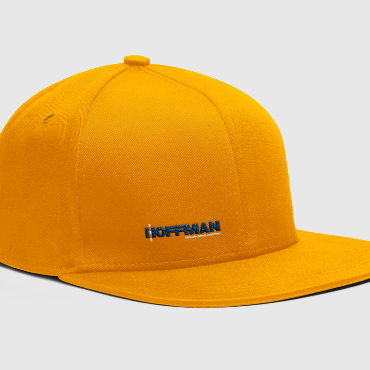
The logo forms the basis of the visual identity, which, along with colors and graphic elements, is applied to all media for print and web, to create a conceptual expression.

A media must be able to stand alone and clearly and unequivocally show who the sender is, so that each media is a strengthening of the overall concept, and contributes to the value of a recognizable visual identity and a strong brand.

Hoffman
Hoffman
Hoffman
Hoffman