Ertes Building and Construction

Ertes

Logo design with solid foundation

Ertes is a small Dutch construction company that has its primary market in the southern and eastern part of Holland.

The task was to design a logo that signaled weight, strength and stability.

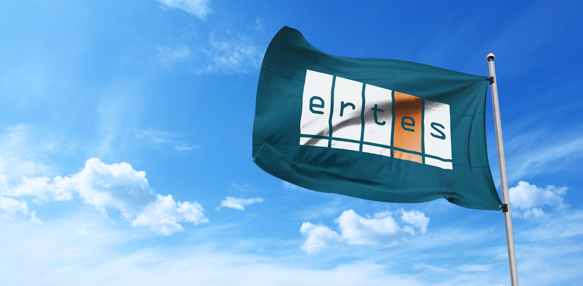
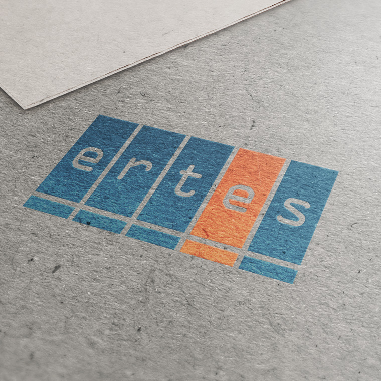
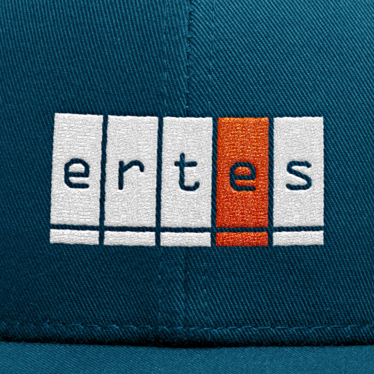
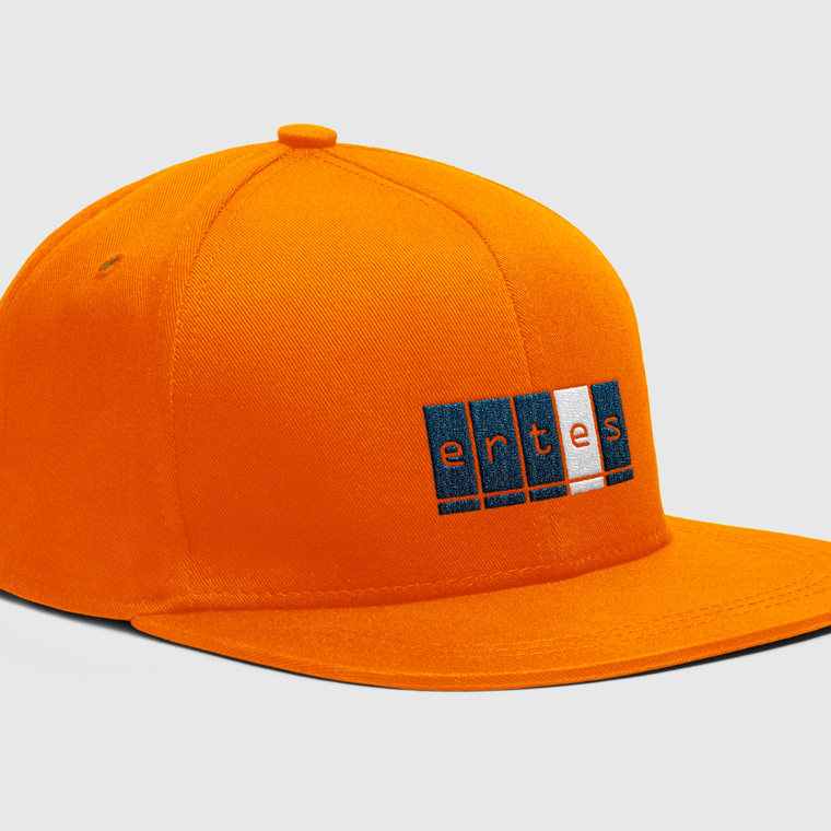
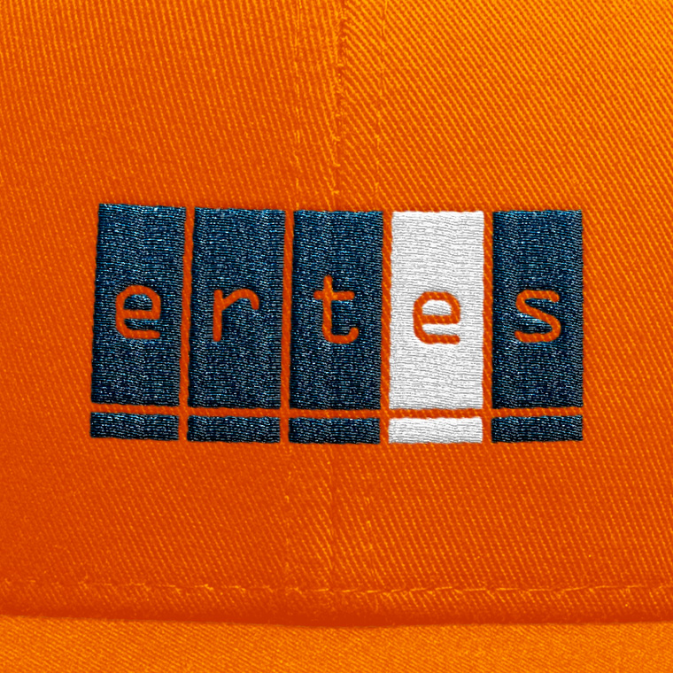
I designed this logo, where each character in the name is placed in a block separately, to create weight, Under each block is a supporting foundation to express stability.

To create a unique identity, the name is set with an elegant type with a slight technical expression.

The color scheme is set with a heavy blue color, and a vibrant orange as a contrast color. The orange color is largely contributing to the identity, and it is used more on equipment, such as construction machinery, tools, work clothes and helmets.
Ertes
Ertes
Ertes
Ertes
Ertes

Business card and stationary

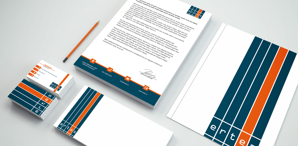
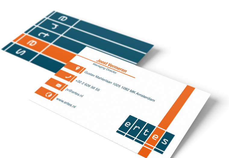
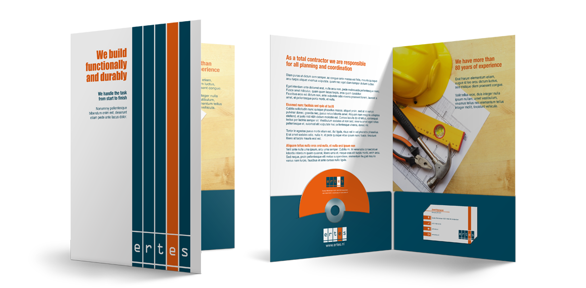
With basis in the logo, I designed business cards and stationary for Ertes.

The use of logo, colors and graphic elements are weighed closely with each media, to create an appropriate visual relation.

The layout of the different media primarily takes into account the nature and function of the media, so that it can perform its task without drowning in a graphical abundance.

Ertes
Ertes
Ertes
Ertes
Ertes
Ertes

The conceptually strong brand

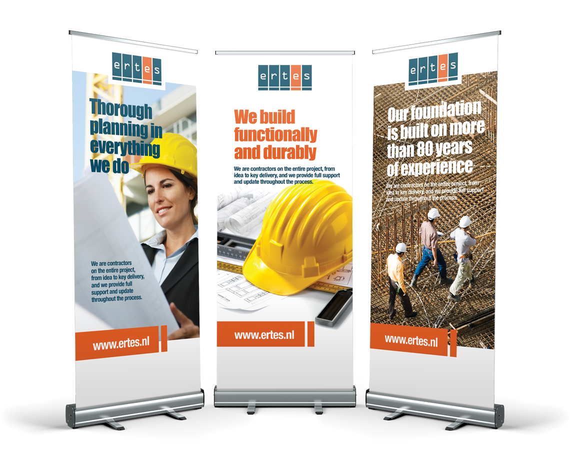
The logo forms the basis of the visual identity, which, along with colors and graphic elements, is applied to all media for print and web, to create a conceptual expression.

A media must be able to stand alone and clearly and unequivocally show who the sender is, so that each media is a strengthening of the overall concept, and contributes to the value of a recognizable visual identity and a strong brand.

Ertes
Ertes
Ertes