E*Spot Discotheque

E-Spot

Spot on expression for E*Spot

Discotheque E*Spot in Berlin works with the philosophy, that one can achieve an almost erotic trance through dance and music, without the use of prohibited drugs.
Hence the name E*Spot - initially a fun distortion of the term G-Spot, which refers to the passion in the dance. But it also works as an indication, that it is a hotspot for electronic music.

The logo I designed for them really has a grunge expression, which can hardly be said to be electronica. But an electronic expression quickly became too stringent and sterile, compared to what the people behind E*Spot wanted with the place. So when I presented this expression to the customer, opposed to a few other suggestions, they were not in doubt as to which they wanted to use.

E-Spot
E-Spot
E-Spot
E-Spot
E-Spot

The conceptually strong brand

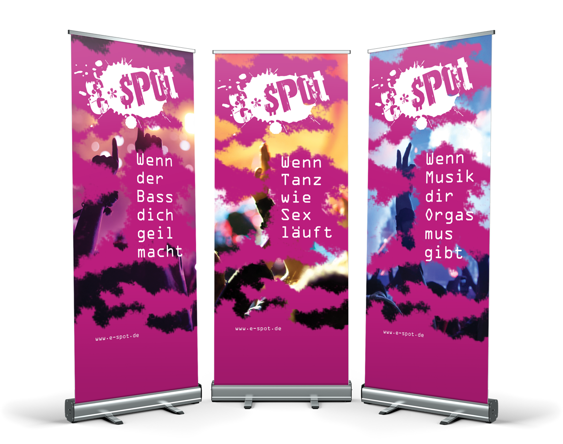
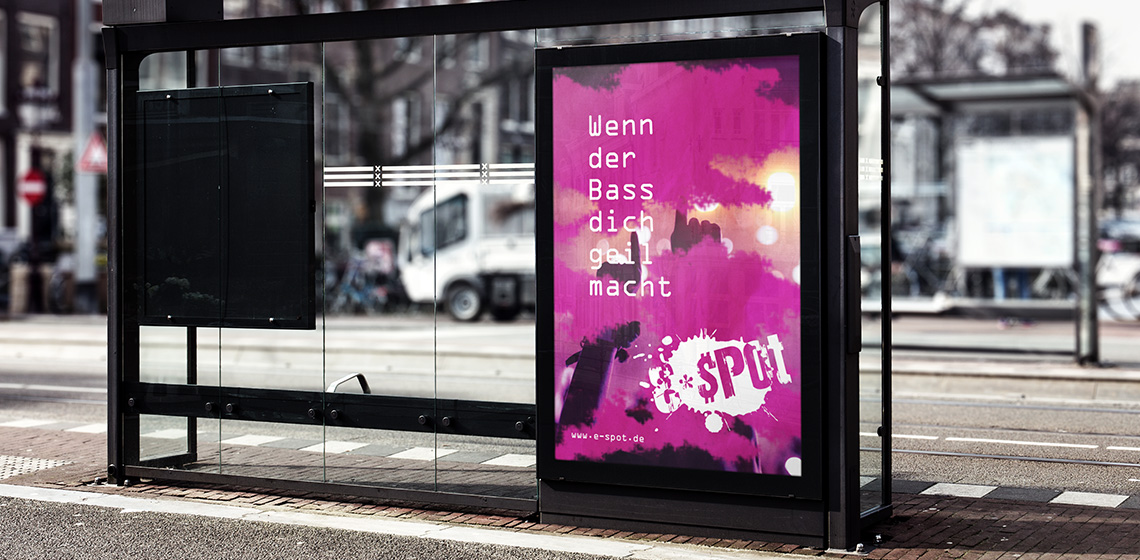
The logo forms the basis of the visual identity, which, along with colors and graphic elements, is applied to all media for print and web, to create a conceptual expression.

The use of logo, colors and graphic elements are weighed closely with each media, to create an appropriate visual relation.

E-Spot

The layout of the different media primarily takes into account the nature and function of the media, so that it can perform its task without drowning in a graphical abundance.

A media must be able to stand alone and clearly and unequivocally show who the sender is, so that each media is a strengthening of the overall concept, and contributes to the value of a recognizable visual identity and a strong brand.

E-Spot
E-Spot
E-Spot
E-Spot