Daytona

Daytona

The sound of Daytona

Two young guys had been on a round trip together in North America.
When they came home to Denmark, they had gotten the idea to start a company that made loudspeakers. The company was to be called Daytona.

When asked if I wanted to design a logo for them, I was up for the idea.

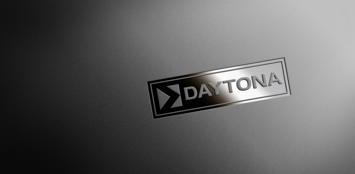
The wish was first and foremost that the name was set with a clear and easily recognizable type. In addition, a small and simple graphic element was designed and added to create a unique identity.

I designed this logo set with a semi-fat sans-serif type.
The graphic element I added is a simple yet unique form, that has a parallel to both audio and the name Daytona.

Daytona
Daytona
Daytona
Daytona
Daytona

The conceptually strong brand

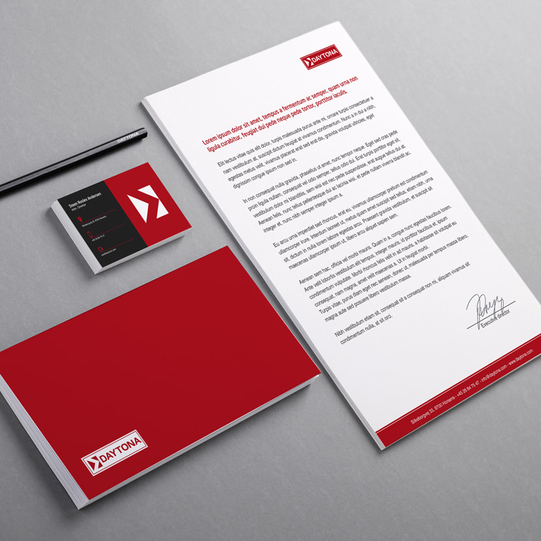
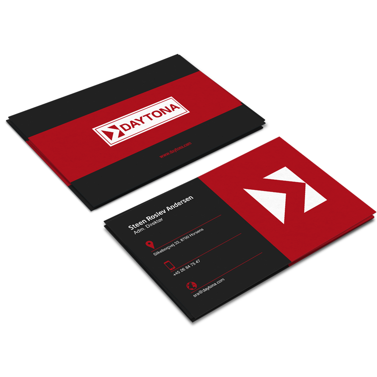
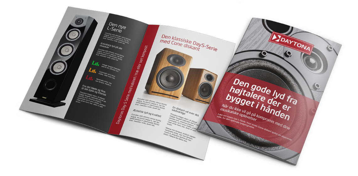
The logo forms the basis of the visual identity, which, along with colors and graphic elements, is applied to all media for print and web, to create a conceptual expression.

The use of logo, colors and graphic elements are weighed closely with each media, to create an appropriate visual relation.

The layout of the different media primarily takes into account the nature and function of the media, so that it can perform its task without drowning in a graphical abundance.

A media must be able to stand alone and clearly and unequivocally show who the sender is, so that each media is a strengthening of the overall concept, and contributes to the value of a recognizable visual identity and a strong brand.

Daytona
Daytona
Daytona
Daytona
Daytona