BeeLeaf

BeeLeaf

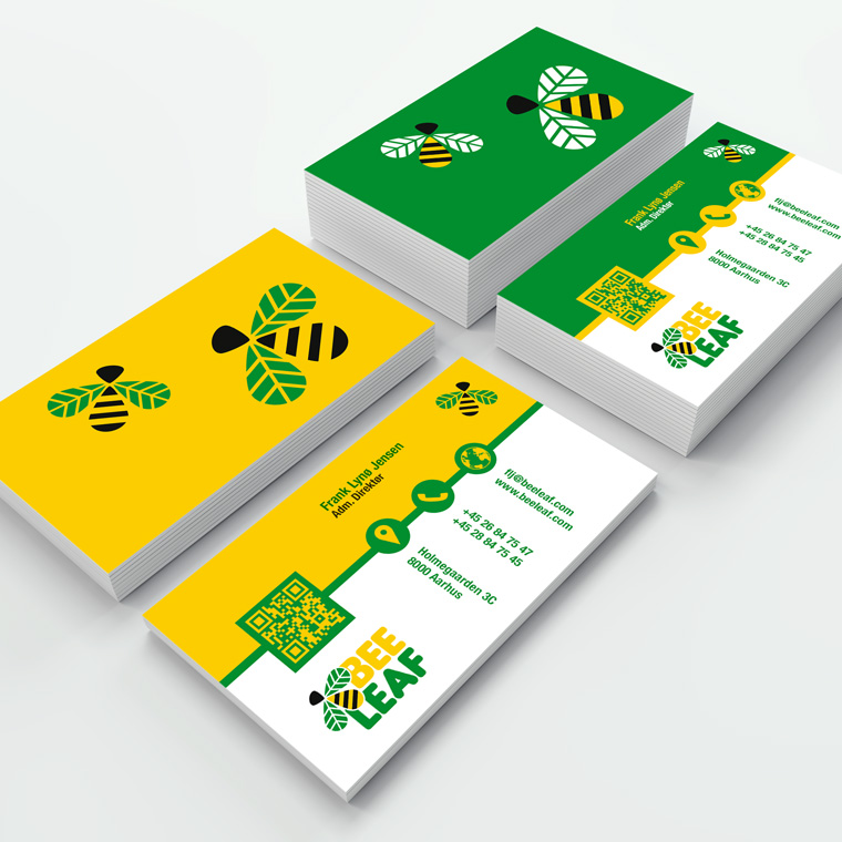
Environmentally friendly logo design

The logo for BeeLeaf is one of my more special designs, that I made for the environmental group of the same name.

I had no limits, so I chose to design a large and full logo, set up with a soft rounded type.
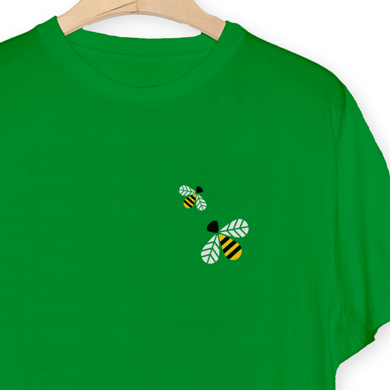
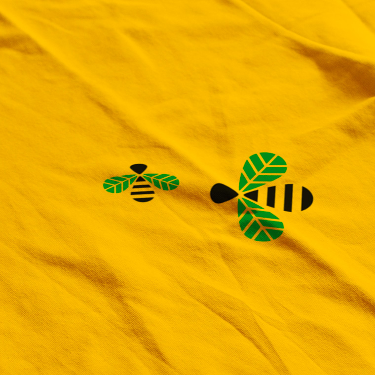
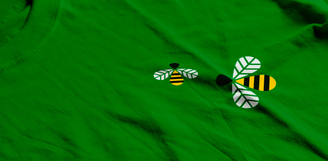
In addition, I designed a graphic element that visually plays with the name BeeLeaf, and which can be used alone to brand the environmental group.

The color scheme is fresh natural colors that contrast well.

BeeLeaf
BeeLeaf
BeeLeaf
BeeLeaf
BeeLeaf

The conceptually strong brand

The logo forms the basis of the visual identity, which, along with colors and graphic elements, is applied to all media for print and web, to create a conceptual expression.

The use of logo, colors and graphic elements are weighed closely with each media, to create an appropriate visual relation.

The layout of the different media primarily takes into account the nature and function of the media, so that it can perform its task without drowning in a graphical abundance.

A media must be able to stand alone and clearly and unequivocally show who the sender is, so that each media is a strengthening of the overall concept, and contributes to the value of a recognizable visual identity and a strong brand.

BeeLeaf
BeeLeaf