Aturo Sports

Aturo

Strong new expression makes Aturo Sports more visible

When the small American company Aturo Sports had been in existence for 8 years, they decided to get a new visual identity, including a new logo.
The wish was a unique and easily recognizable expression, that made Aturo Sports more visible on the market.

I designed this logo, where the name is set with a bold type, but composed in a way that creates a unique expression.
The logo is strong and compact, to underline the strength and intensity of Aturo Sports' work.

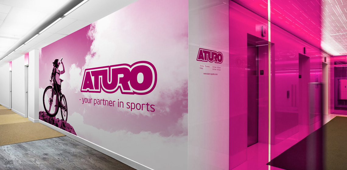
The color scheme is set with a fresh pink color, that differentiates it from other brands in the industry, and that manifests Aturo Sports as the young player, who is not afraid to challenge and go new ways.

Aturo
DAE
Aturo
Aturo
Aturo

Business card and stationary

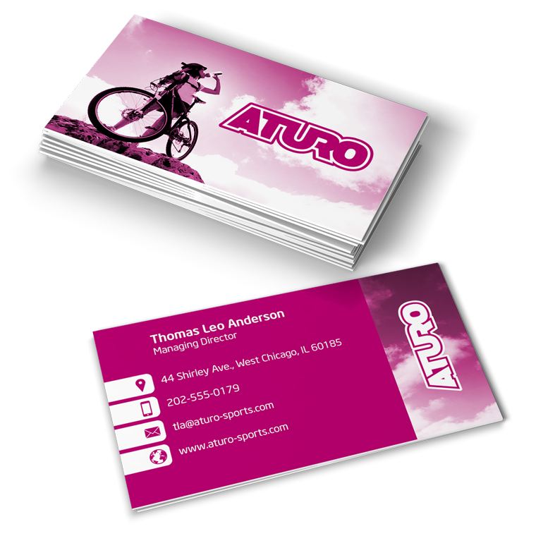
With basis in the logo, I designed business cards and stationary for Aturo Sports.

The use of logo, colors and graphic elements are weighed closely with each media, to create an appropriate visual relation.

The layout of the different media primarily takes into account the nature and function of the media, so that it can perform its task without drowning in a graphical abundance.

Aturo

The conceptually strong brand

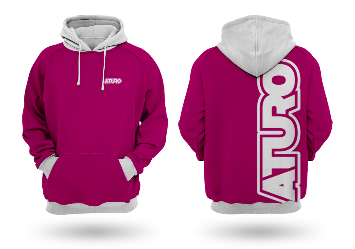
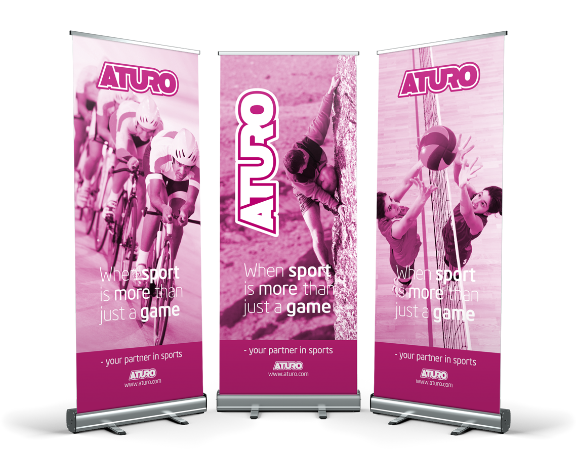
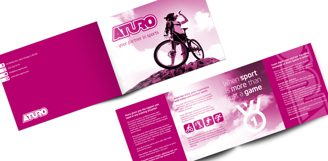
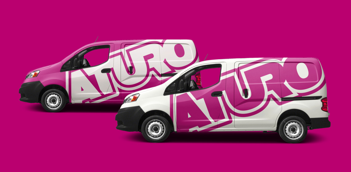
The logo forms the basis of the visual identity, which, along with colors and graphic elements, is applied to all media for print and web, to create a conceptual expression.

A media must be able to stand alone and clearly and unequivocally show who the sender is, so that each media is a strengthening of the overall concept, and contributes to the value of a recognizable visual identity and a strong brand.

Aturo
Aturo
Aturo
Aturo
Aturo