Memo

Memo

New name and logo for Memorandum

When the Memorandum made a restructuring with a new business plan and vision, they addressed me to get a dialogue about their visual identity.

In collaboration we decided to create a shorter name that was easier to brand.
The choice fell on Memo, an abbreviation of the existing Memorandum. Thus, they did not move into something new, but resembled what they came from.

I designed this logo that plays with a positive/negative effect to create the identity.
The logo is set in bold with typeface Helvetica.

Memo
Memo
Memo
Memo
Memo

The conceptually strong brand

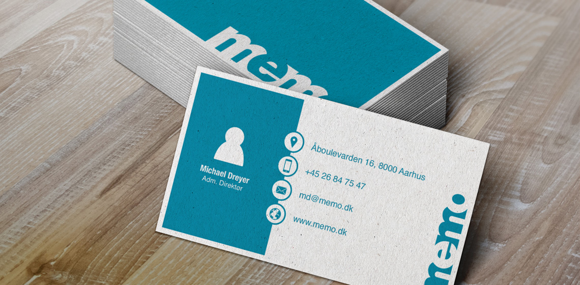
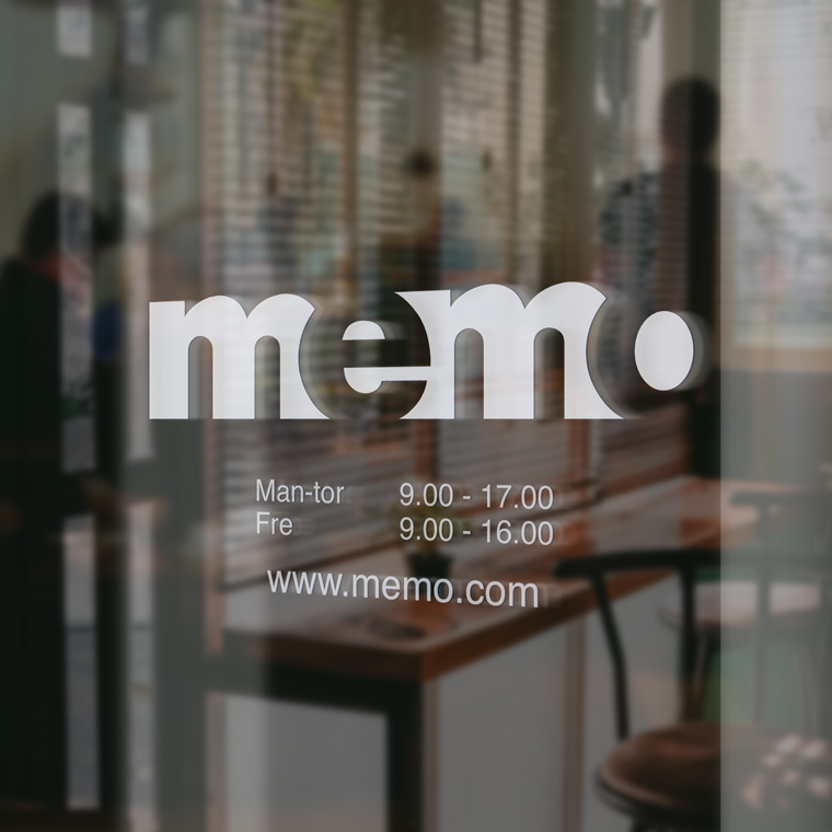
The logo forms the basis of the visual identity, which, along with colors and graphic elements, is applied to all media for print and web, to create a conceptual expression.

The use of logo, colors and graphic elements are weighed closely with each media, to create an appropriate visual relation.

The layout of the different media primarily takes into account the nature and function of the media, so that it can perform its task without drowning in a graphical abundance.

A media must be able to stand alone and clearly and unequivocally show who the sender is, so that each media is a strengthening of the overall concept, and contributes to the value of a recognizable visual identity and a strong brand.

Memo