Actura Accounting

Actura

When the accounts are correct

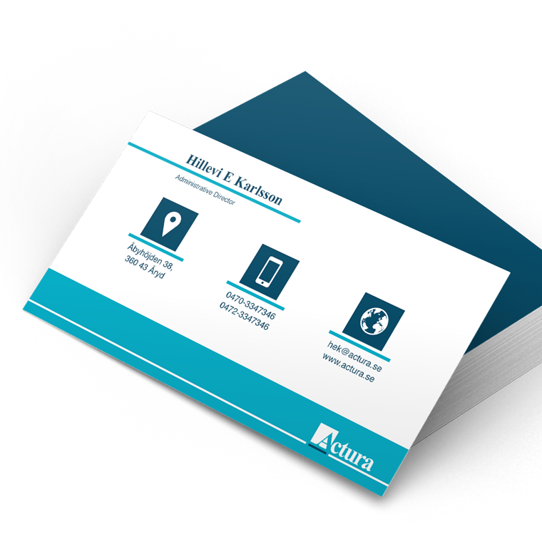
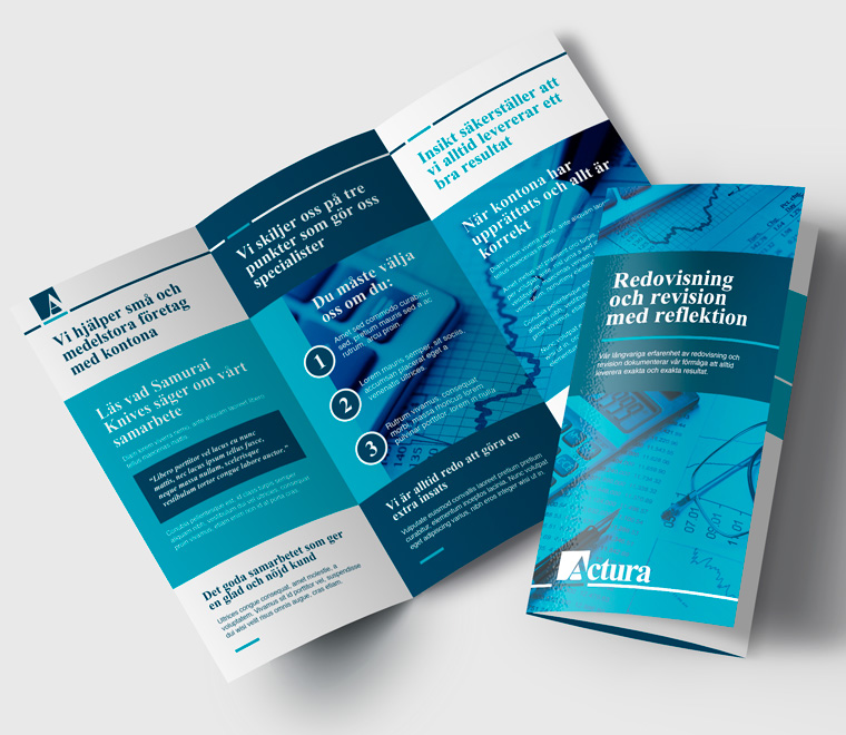
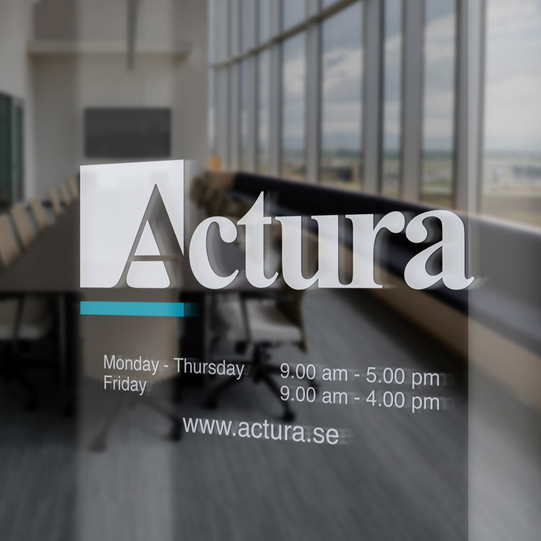
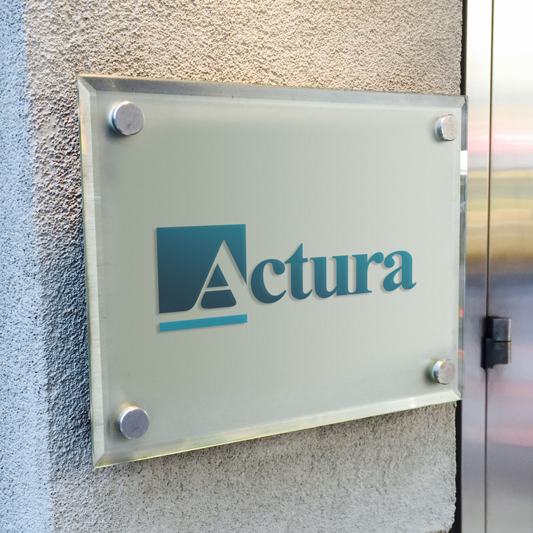
When the audit company Actura renewed their visual identity, they asked if I could develop a new logo and concept for them.
The wish was an expression that did not differ too much from their existing expression, or the general expression in the industry.

I designed a discreet and slightly conservative logo and concept, where the name is set with a classic elegant type.

The identity is largely in the negative A, which is highlighted in a square and underlined with a brighter contrast color.
The slight underlining is to create a strong graphical element that can stand alone, but it also symbolizes the final result of the accounting - the positive bottom line on a blue line.

Actura
Actura
Actura
Actura
Actura

Business card and stationary

With basis in the logo, I designed business cards and stationary for Actura.

The use of logo, colors and graphic elements are weighed closely with each media, to create an appropriate visual relation.

The layout of the different media primarily takes into account the nature and function of the media, so that it can perform its task without drowning in a graphical abundance.

Actura

From touch point to touch point

Often, a media is just one touch point, in a wide range of multimedia. Therefore, one must often take a previous touch point onto account, in order to create a media that meets the expectations of the recipient.

Next, it must provide an added value that motivates the recipient to take action either by moving on to the next touch point or by making a purchase.

Marketing material is designed with respect for the concept and the visual expression. At the same time, it is designed to serve as a strong media that solves the task and deliver the desired result.

Actura
Actura
Actura